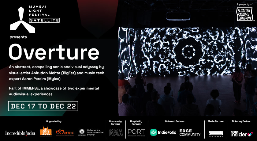
Mumbai Light Festival
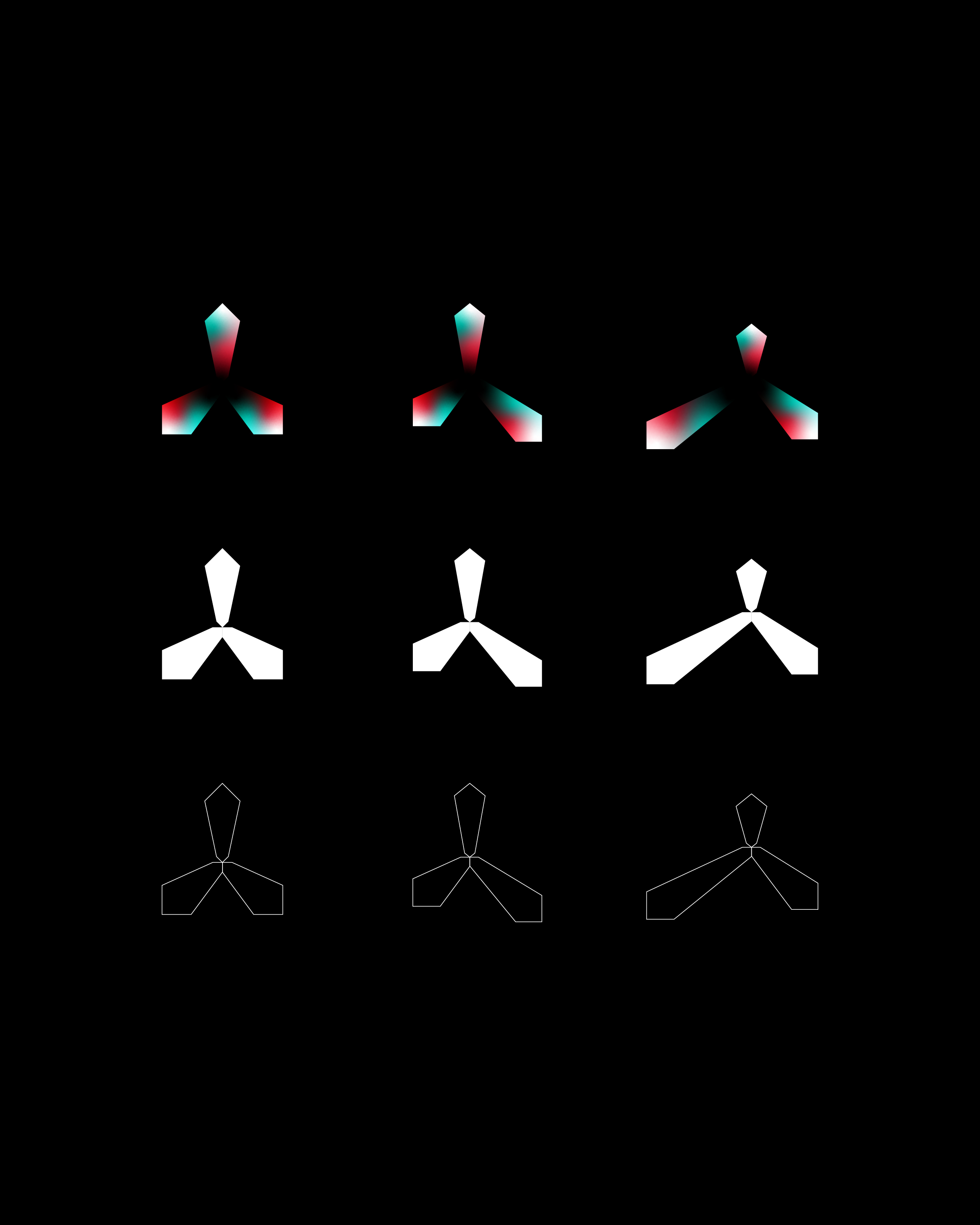
Inspired by the famous tetrapod structure and the cones/angles of light projection. The identity is based on tri colored gradients and a stark contrast with the black background considering many of the installations will be in the night. The applications build on these gradients and different crops and scales that help in creating an unique character for the brand.


“Projecting Mumbai in the simplest way”