Client: Dr.Reddy’s | Worked with: Codesign | Images And Content Credits: Codesign
Project Team: Rajesh Dahiya, Mohor Ray Dahiya, Nia Murphy, Pragun Agarwal and Siddharth Nair.
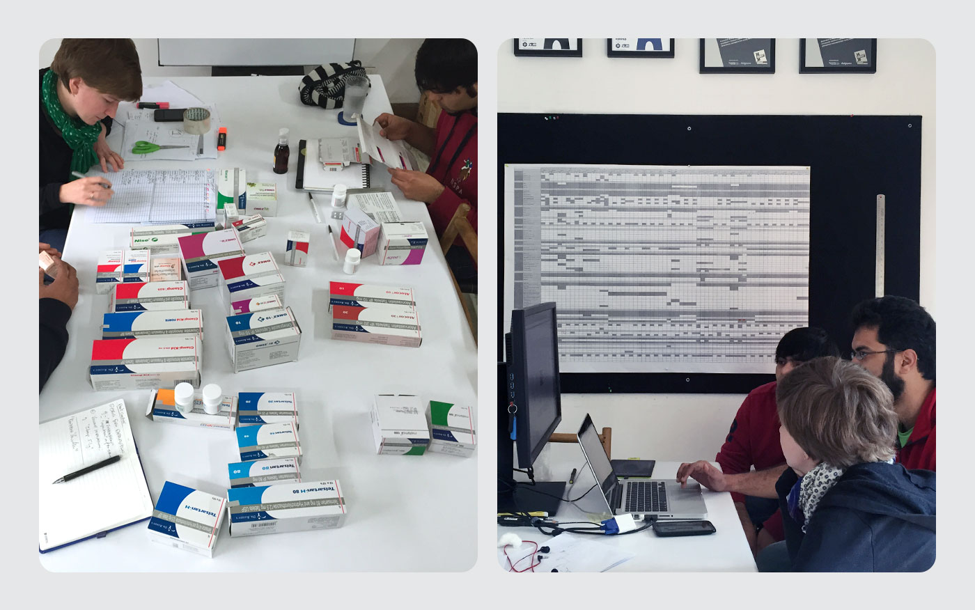
Following a brand rejuvenation exercise, Indian multinational pharmaceutical brand Dr Reddy’s identified communication design for packaging as a key touchpoint to reflect their new patient-first philosophy. The project was driven to build a systematic, sustainable and scalable framework for variation—so that design could be meaningfully executed across offerings and address requirements of different user types, product brands and formats. I was part of the team that worked on this project right from it’s initial stages to final implementation of the new brand guidelines.
![]()
![]()
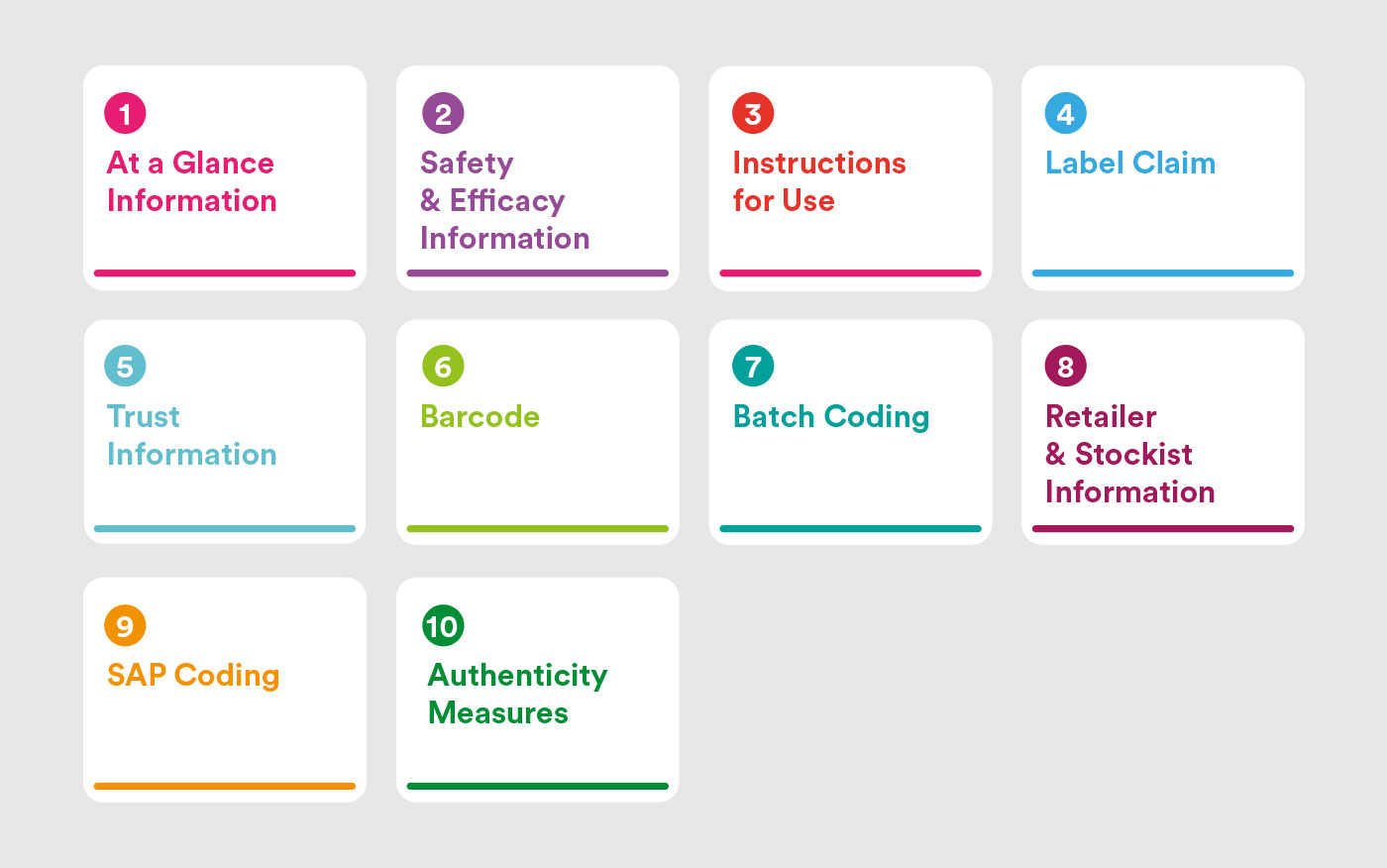
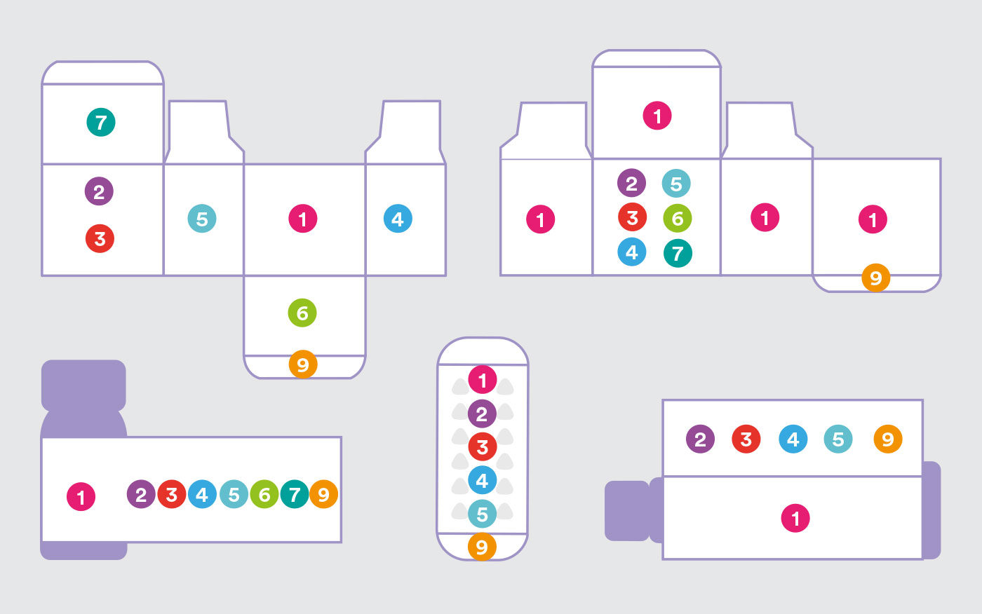
A new all-encompassing structure was created to organise information. This enabled logical and usage-based clustering of a large volume of information that varies across the brand spectrum. For internal brand teams, it provided a consistent structure to collect and create content for design teams. For the internal design teams, it provided a steady reference to apply and adapt designs, without compromising on intended user experience.
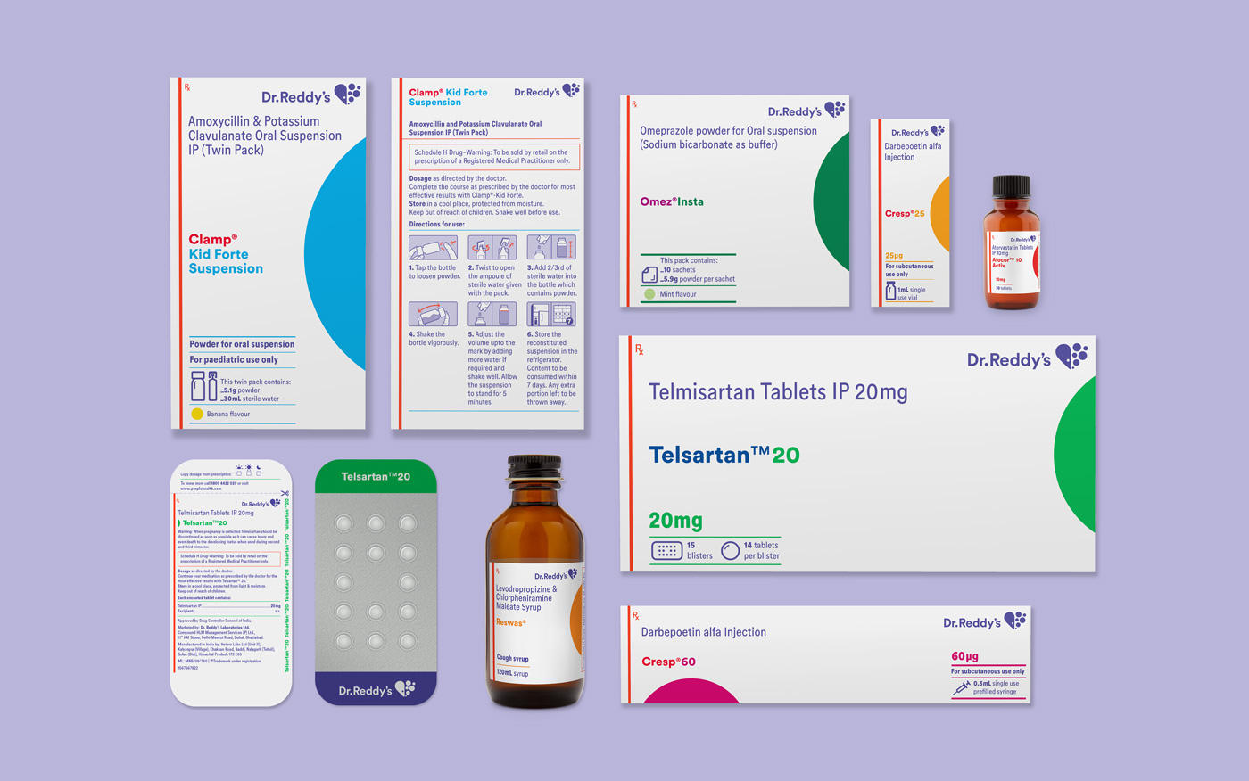
Variants of a product brand are commonly placed together in retail/storage formats. A new system of colour coding was designed to eliminate errors in identifying variants within a product family, by assigning a distinct colour to the variants.
For quick and correct identification of products, in commonly disorganised retail storages, product identification information was made visible on all faces of secondary packaging.
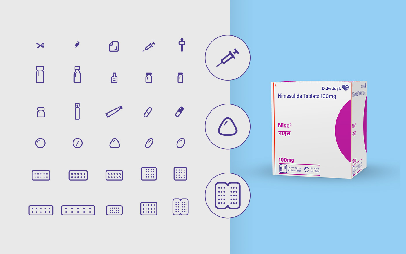
A new system of product icons helps users in product identification and understanding package contents.
![]()
![]()
![]()
The design system strategically deploys visual elements to support functionality, bring clarity and enhance user experience. A custom, detailed language for instructional illustrations helps patients with varying levels of literacy correctly administer and use products.
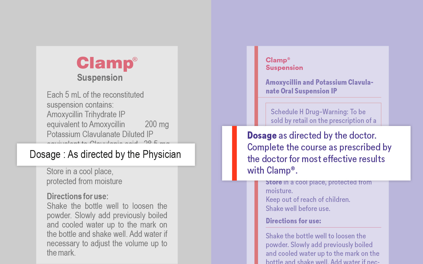
Condensed variants of the brand font were commissioned to allow for clearer readability at smaller type sizes, especially for small pack sizes. Recommendations for language modification to help users understand significance of use as per instructions and prompt better adherence.