Client: Dekorate| Worked with: Codesign | Images And Content Credits: Codesign
Project Team: Rajesh Dahiya, Pragun Agarwal, Mohor Ray Dahiya and Sidharth Nair.
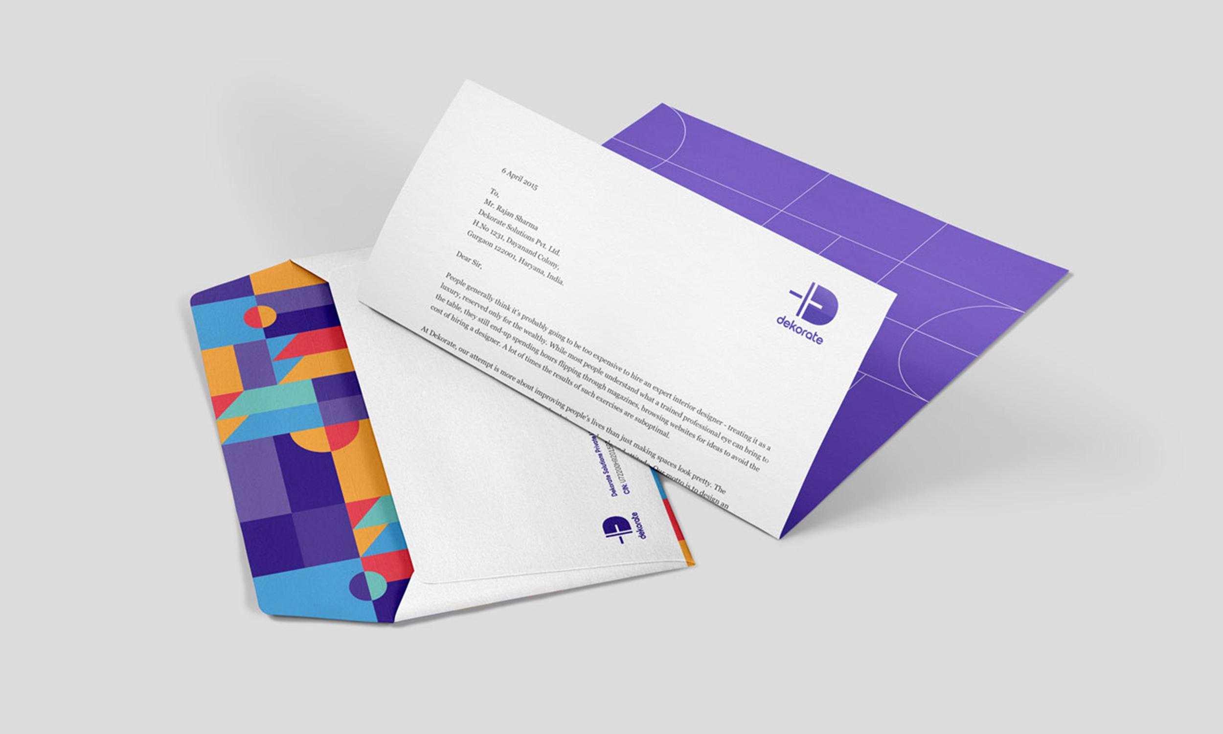
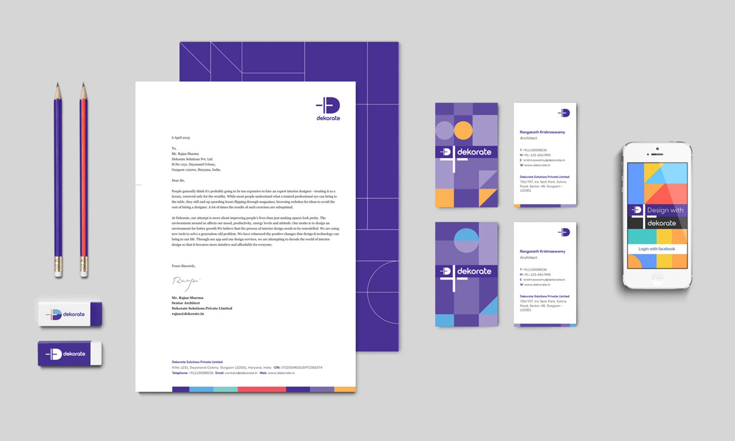
From mobility to dining, from recruiting to dating, a whole new world of mobile applications have simplified how we do things with a higher degree of convenience and satisfaction. The Dekorate app was conceived to bring an intuitive and affordable approach to interior design—an activity with high user involvement, but often challenged by lack of access to trained design professionals and the ability to visualise changes during the process of redesign. The core strength of the Dekorate app lies in its ability to bring an assisted approach to the design process for the end-user.
The promise of easing the iterative process of interior design and helping users participate in the process with ease, set the tone for a vibrant language based on simple, playful grids with flexibility for use in promotions, communication and product interface.
Client: Script | Worked with: Codesign | Images And Content Credits: Codesign
Project Team: Rajesh Dahiya, Mohor Ray Dahiya and Pragun Agarwal.
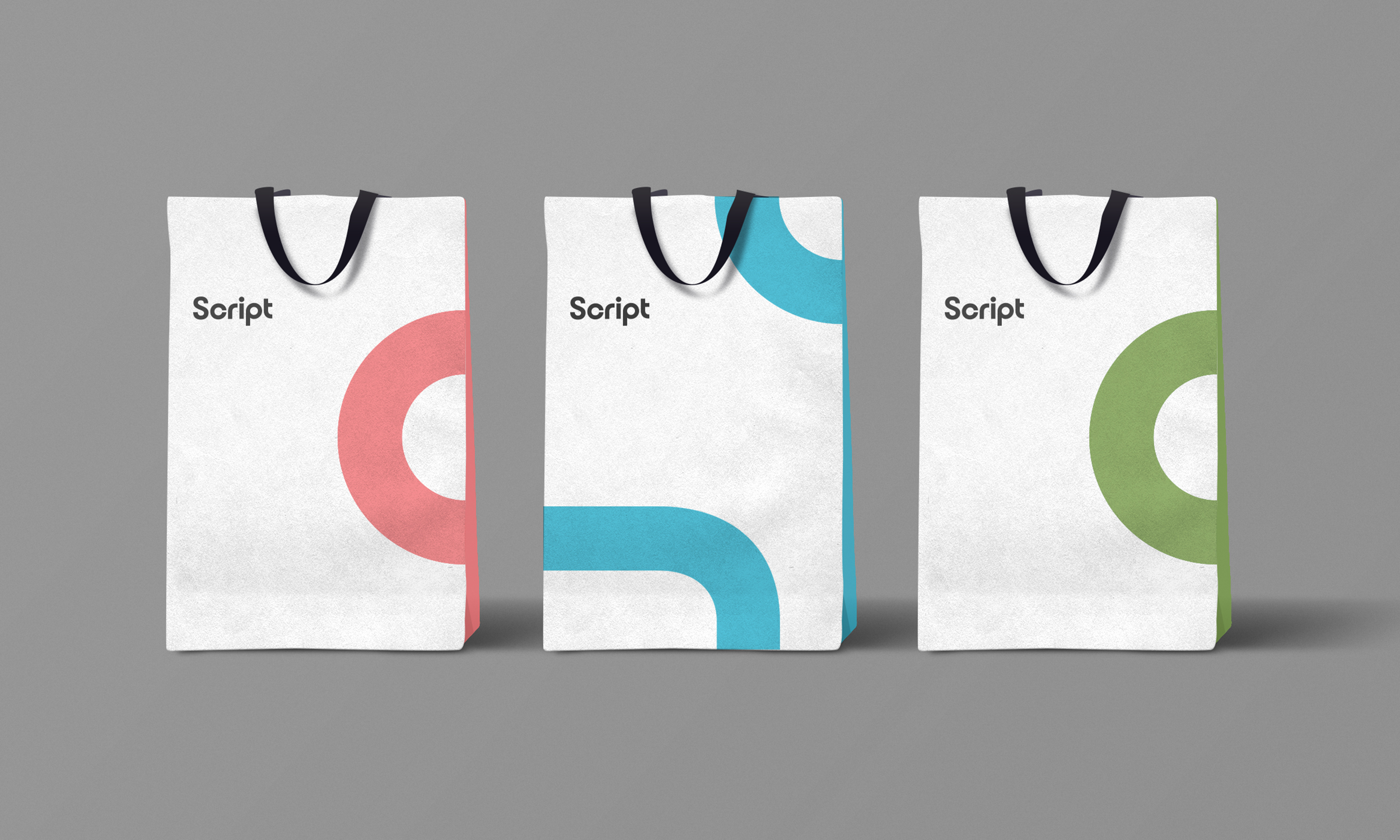
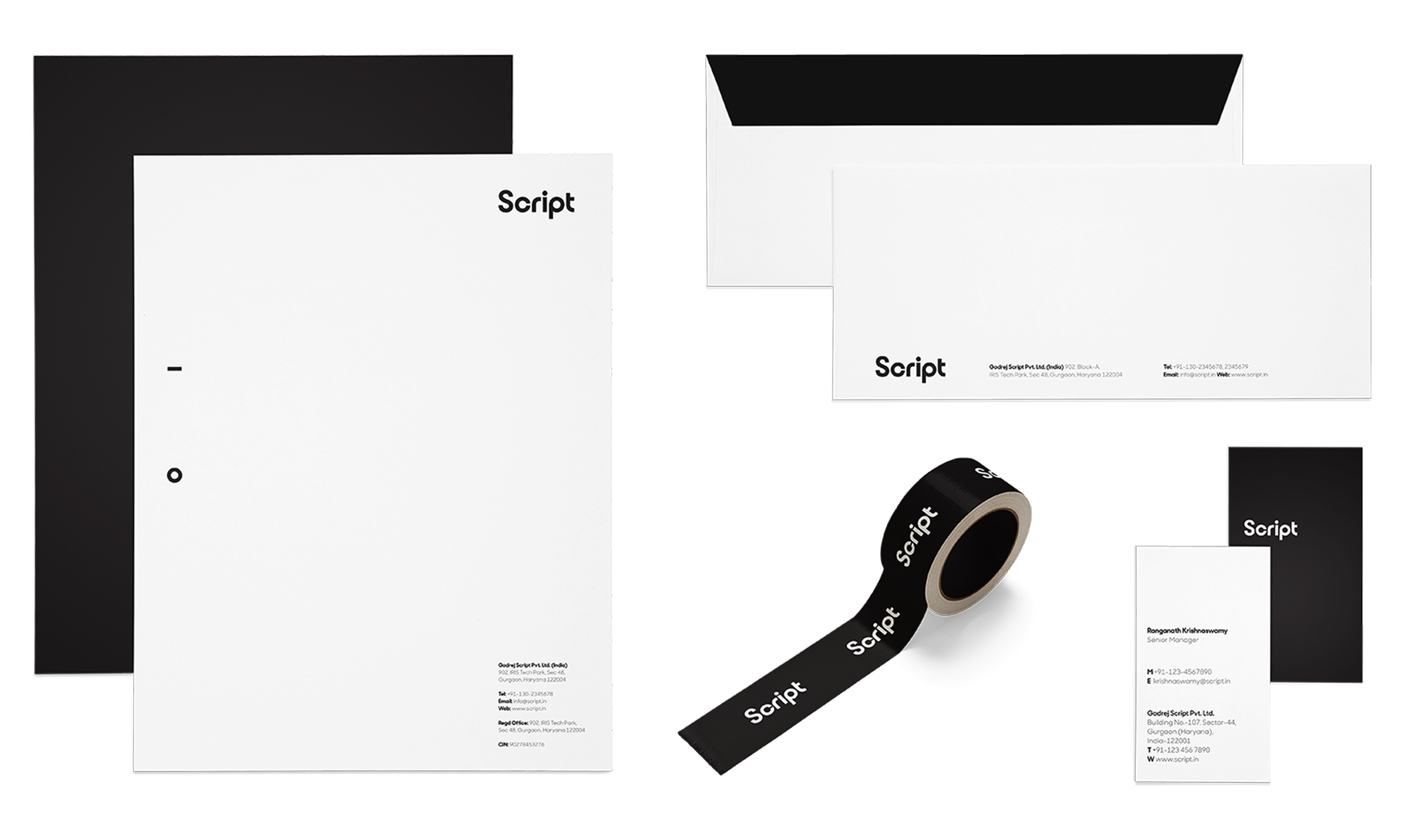
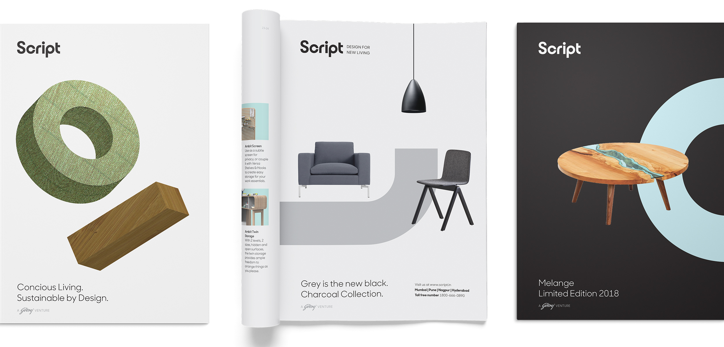
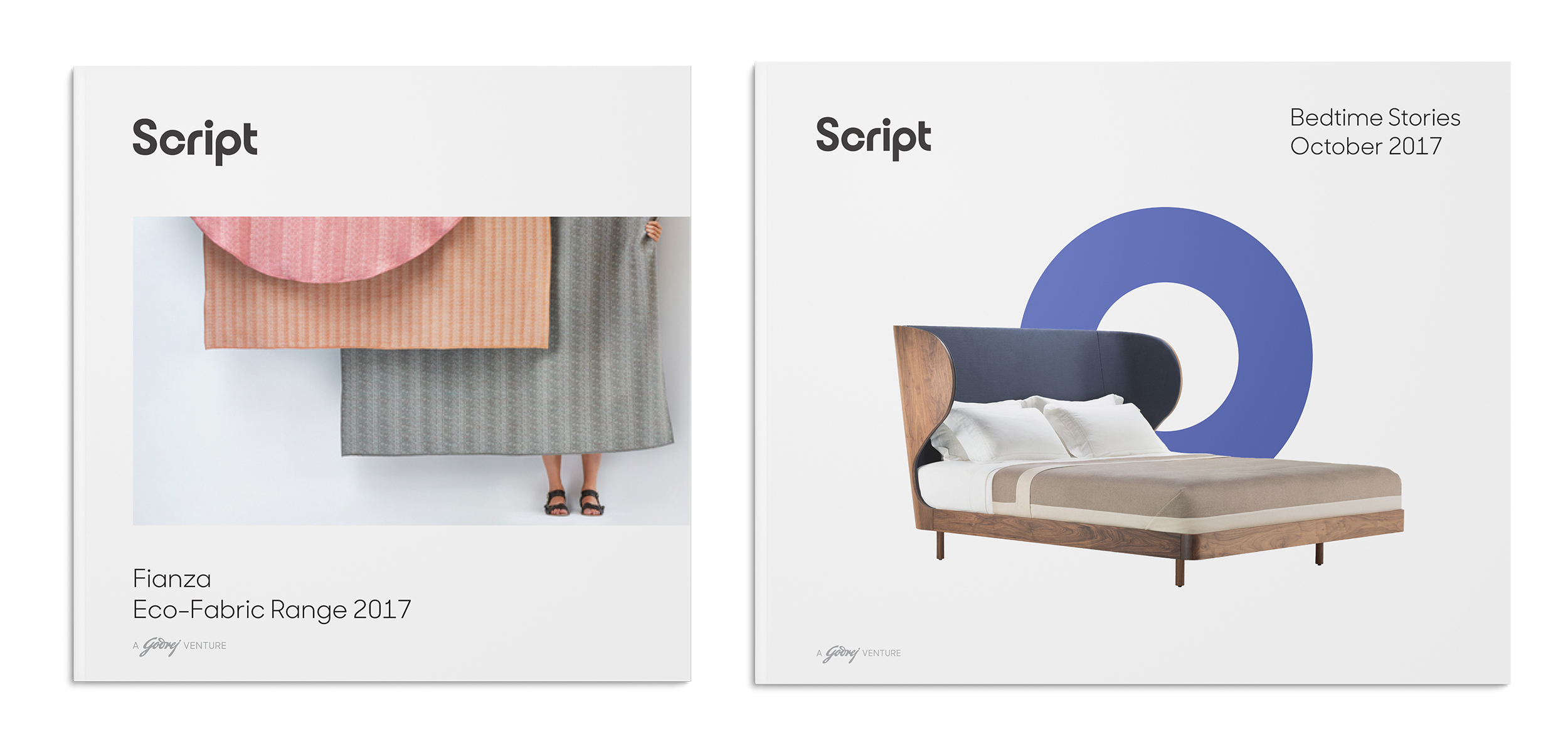
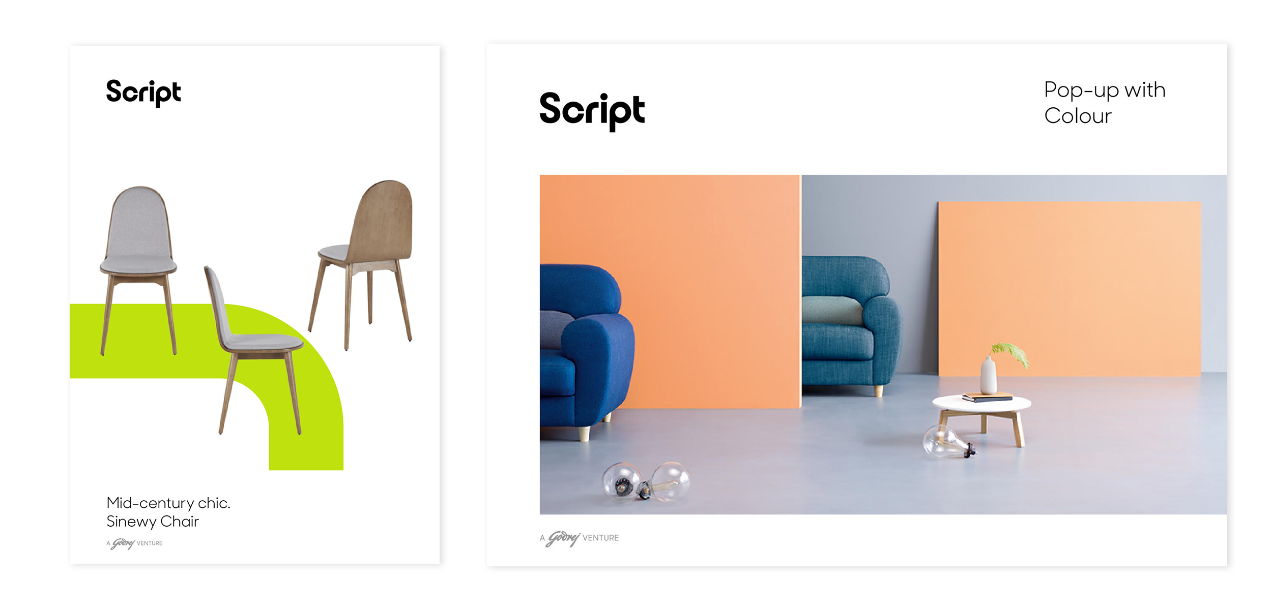
Script is a new brand by Godrej & Boyce, offering contemporary furniture & decor accessories across mass-premium, urban markets in India. Script marks the entry of the Godrej group into a new segment that is sharply differentiated from their established budget furniture brand Interio. The new brand addresses emerging needs of contemporary lifestyle & home spaces, and delivers solutions backed by Godrej’s intrinsic culture of design & manufacturing innovation.
At Codesign, I was a part of the team that was worked on creating the visual identity system for this new brand. The visual vocabulary for Script establishes an instantly recognizable and distinct aesthetic for the brand. It evokes the core sense of newness & change, with fresh playful design elements while expressing the premiumness of brand with sophisticated restraint in the graphic play.
The brand logo is a simple, sophisticated mark, that exudes warmth while standing out with its geometric construction. Derived from the logo, four Graphic Elements (the bar, bend, ring & half ring) open up a whole ecosystem of activity and play for the design language—cueing the smart agility & adaptability of the products. A rigorous framework sets behaviour for graphic play with the elements creating cohesiveness across vibrant variations.
Team Members: Pragun Agarwal and Sudeepti Tucker
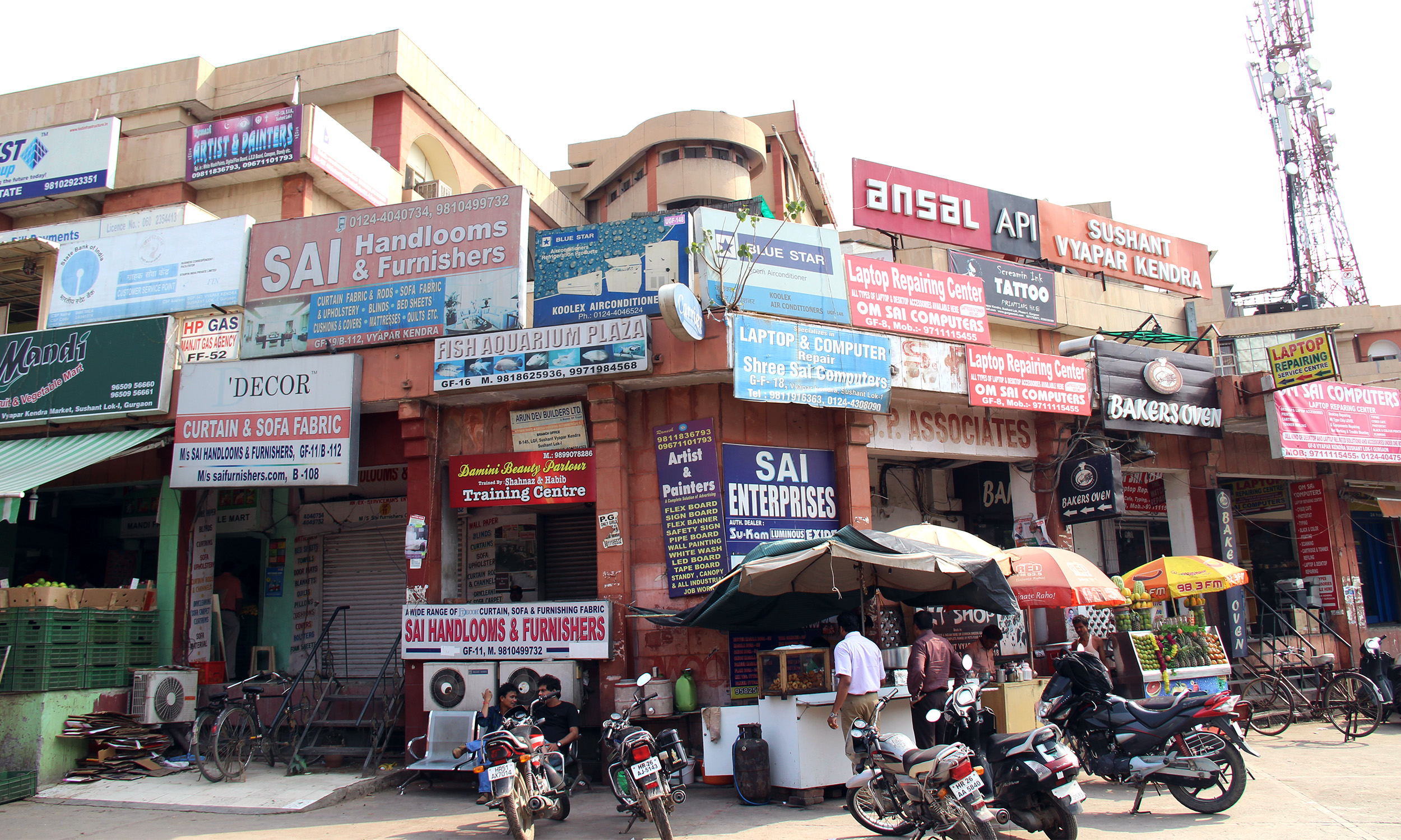
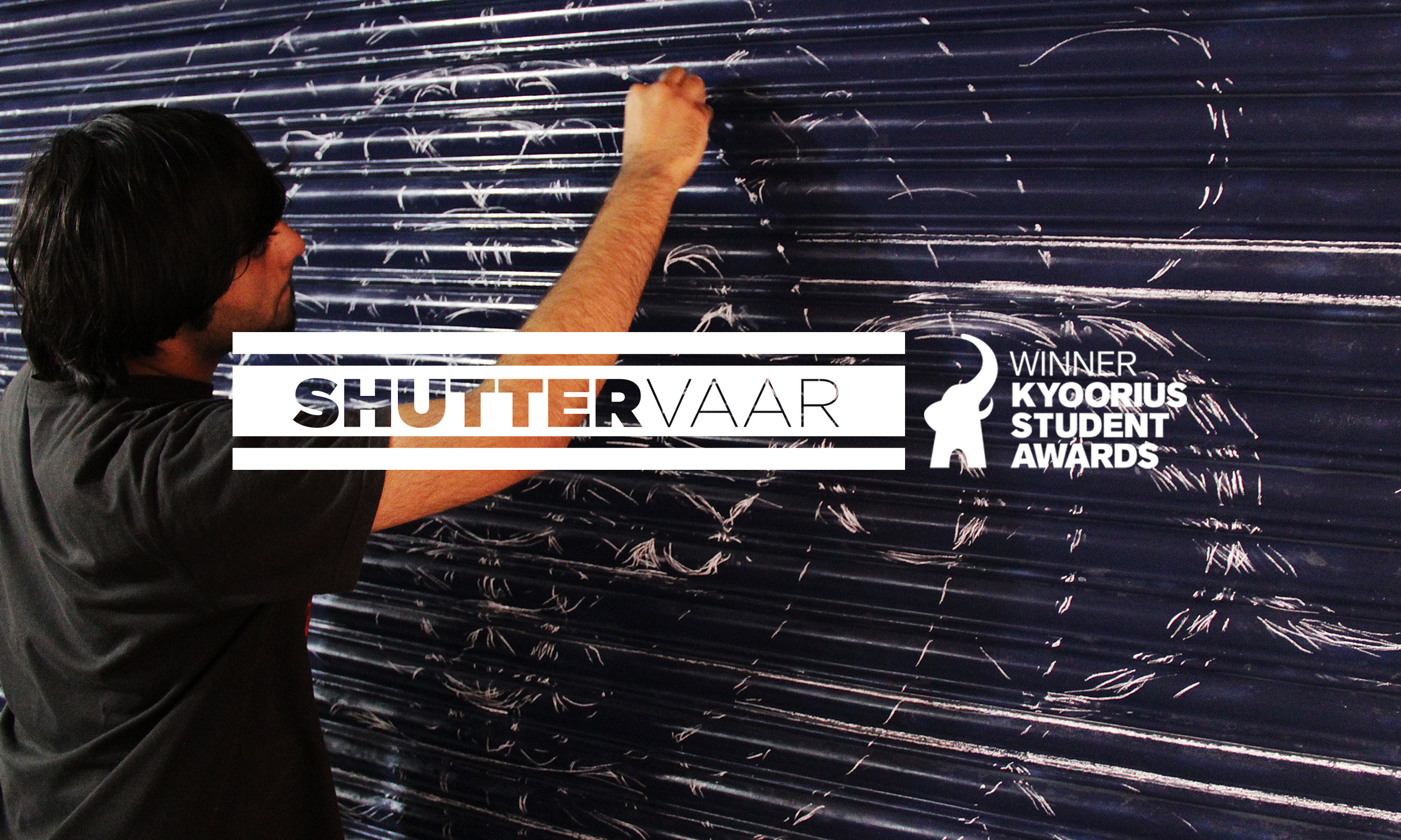
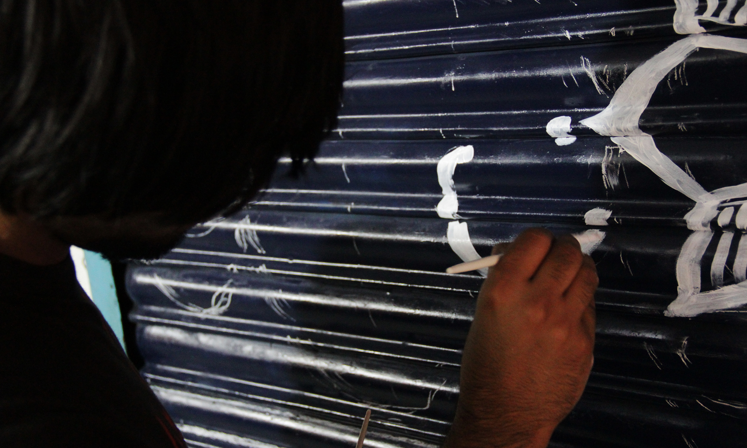
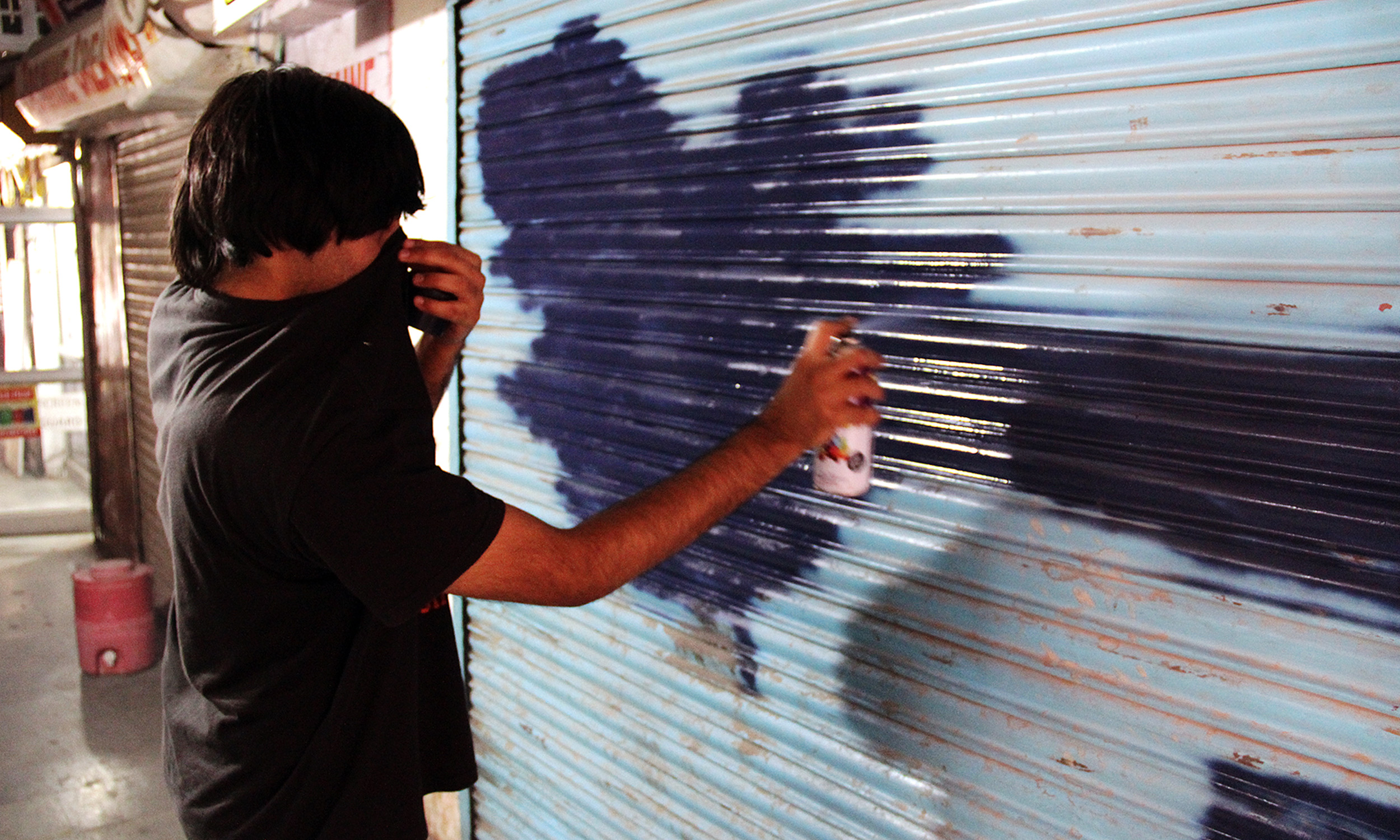
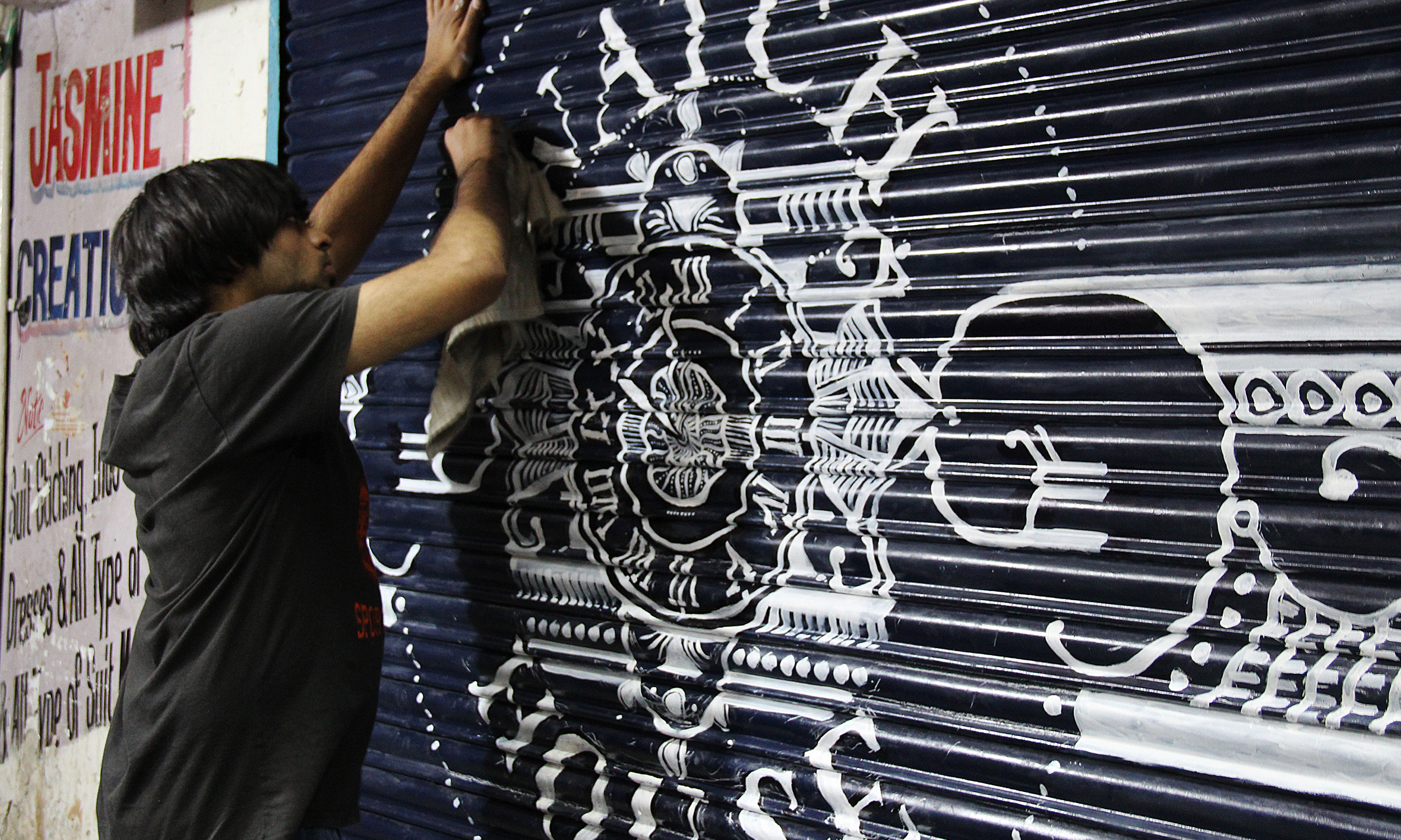
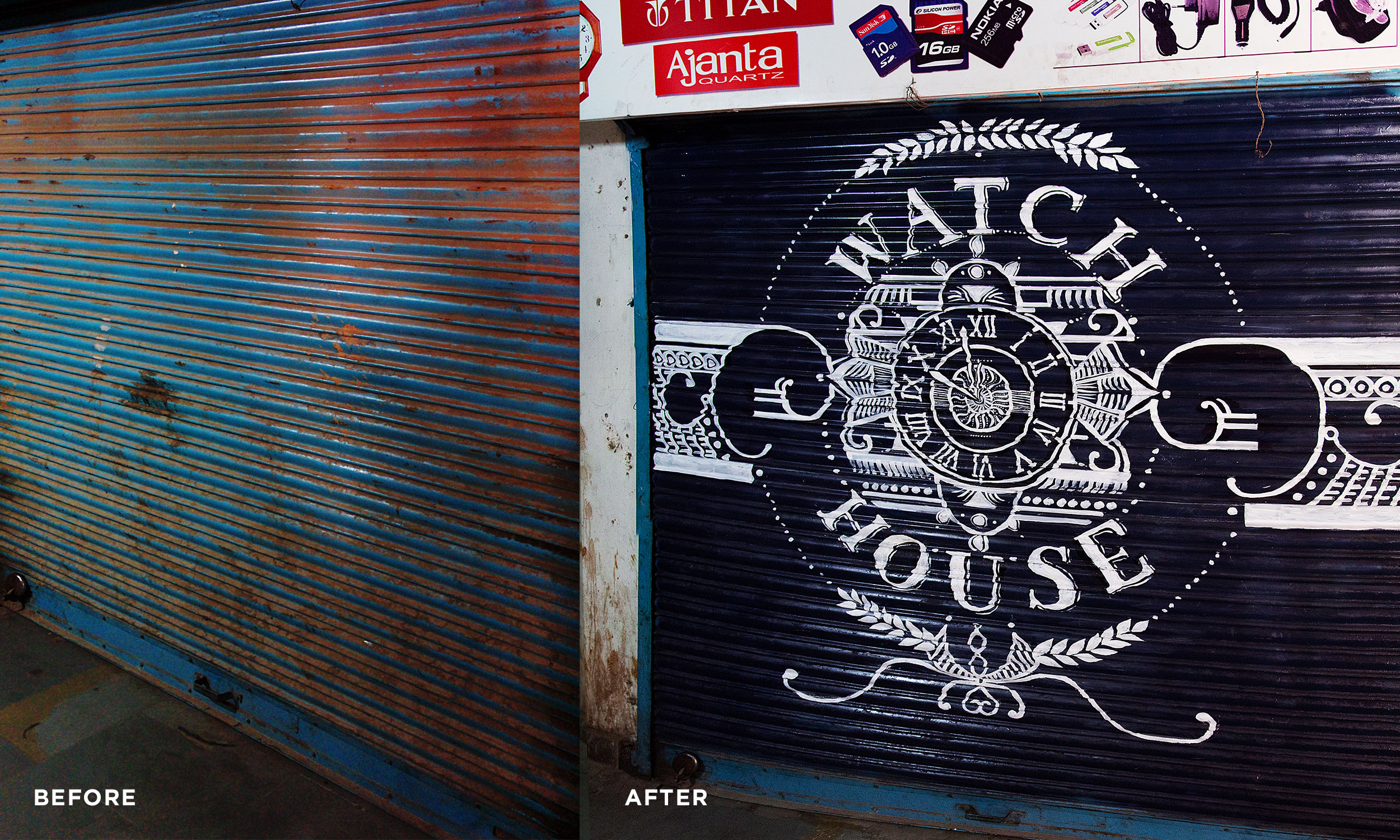
An Award winning entry for the Kyoorius student awards 2014 in the Illustration category.In the brief set by L&K Saatchi & Saatchi, titled ‘Ugly to Beautiful‘, we were asked to identify a part or an aspect of the city we lived in and found ugly and create a design solution using illustration to transform it into something beautiful. 'Shuttervaar' is an initiative that capitalises on these tarnished shutters and the one holiday of the week when they are put to display. With these blank unutilized shutters, the market–space provides several rows of canvasses that if painted uniquely, together can create a system of weekly art displays, a gallery, to advertise, beautify and disseminate. This concept can apply further to similar shopping complexes and plazas. Vyapar Kendra being an example in Gurgaon.
![]()