My final thesis project at the Maryland Institute College Of Art (MICA) for the Graphic Design MFA investigates the positive role of an experience in today’s world and as a potential tool to consider while approaching a design problem.
By taking upon the role of a curator, planner and designer, I looked at the format of a festival/conference/event to provide a platform for the Asian and middle-east design community working in the USA. This provided these designers an opportunity to share their unique insights and connections between their culture and their work.
Titled Toast—International Design Festival, The event took place on 15 February 2019 for the Graphic design community at MICA.
Project mentors: Ellen Lupton, Jason Gottlieb and Jennifer Cole Phillips.

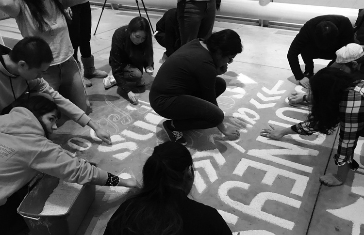
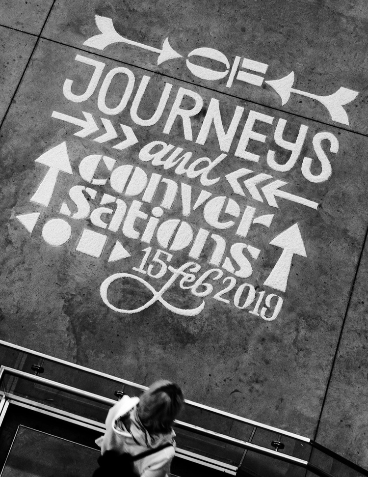
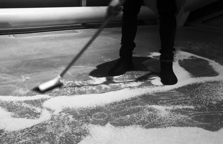
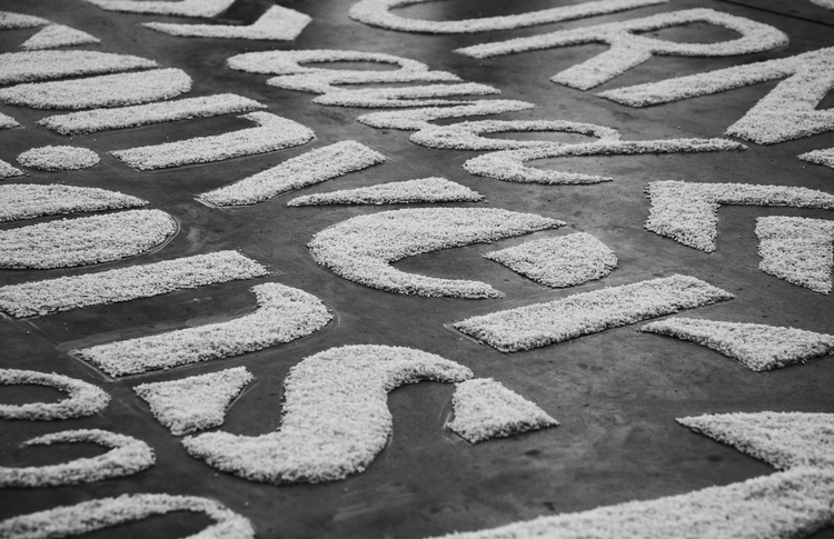
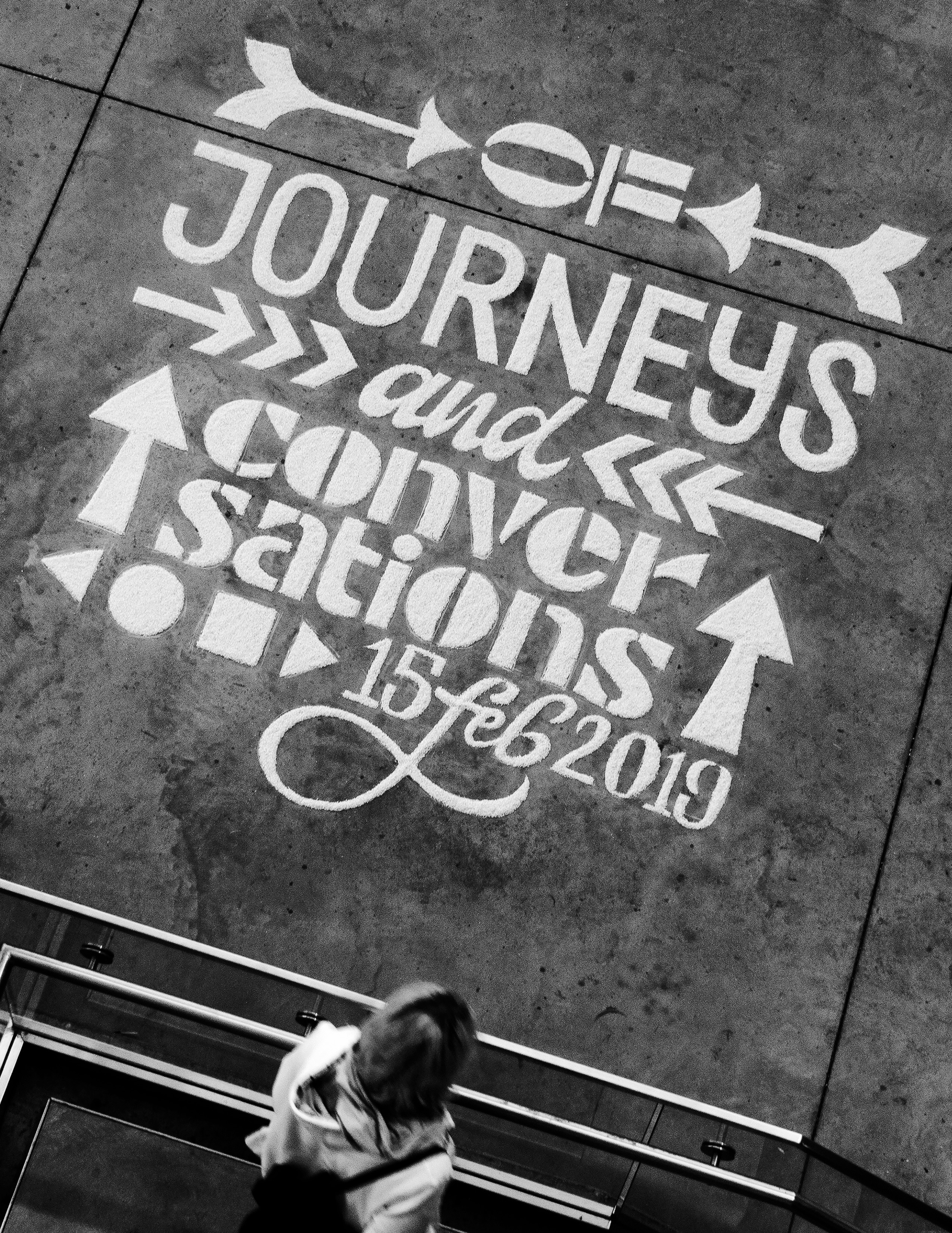
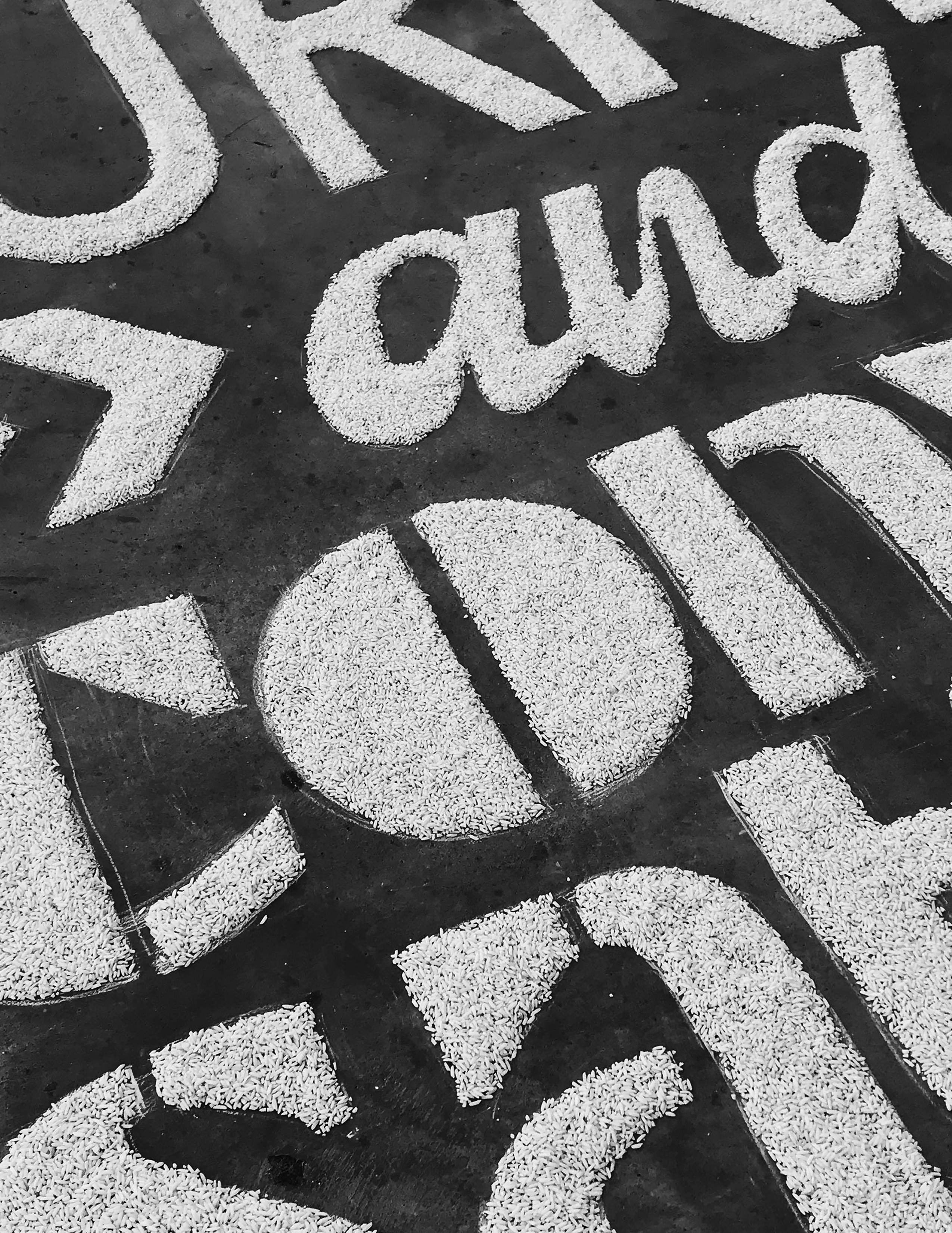
A build up or maintaining a buzz is very important for any festival or event. People use all kinds of techniques and methods to advertise, market and promote the event to the intended target audience. Keeping all these considerations in mind, I planned out a small teaser for my own event. Rangoli is an art form in India. Patterns are made on the ground using rice, sand or flower petals. Different members of the family come together to create this artwork on auspicious days such as Diwali. I used this medium and combined it with typography to create a promotional installation for my thesis. By looking at this traditional art form through a contemporary lens, I have tried to adapt it to a different context while it still retains the original intention of marking a celebration. Based on a grid I sketched with chalk, My GDMFA family at MICA came together to fill In the outlines with rice as a collaborative exercise.

Food is a powerful tool that binds many cultures together. I wanted to choose a single food item or dish that would cater to that purpose. A toast is a perfect example. Simple yet diverse, this food item is integral to almost every cuisine in the world. I used this as the central theme for my event, allowing me to structure all my visual explorations around this food item.


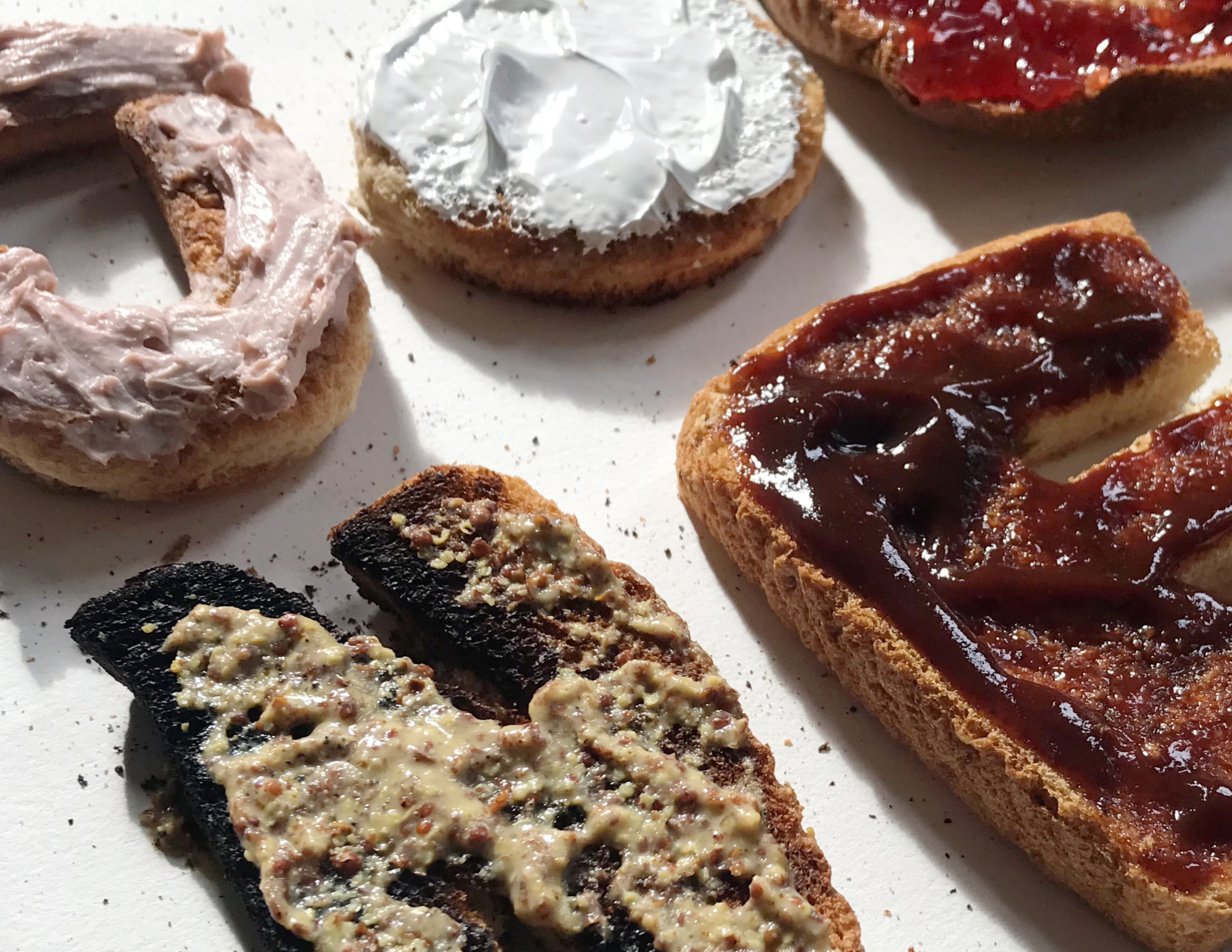
My first approach towards visually representing this idea was a very literal interpretation of the word ‘toast’. I carved out letterforms from toast and applied various condiments to spell out the word 'Journeys'. Even though this was visually engaging, this approach seemed limiting and not diverse enough for an identity system and its applications.


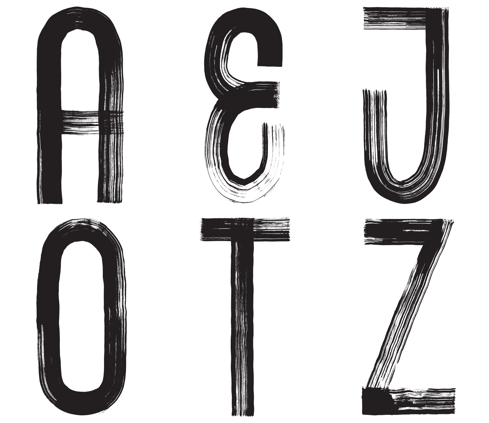
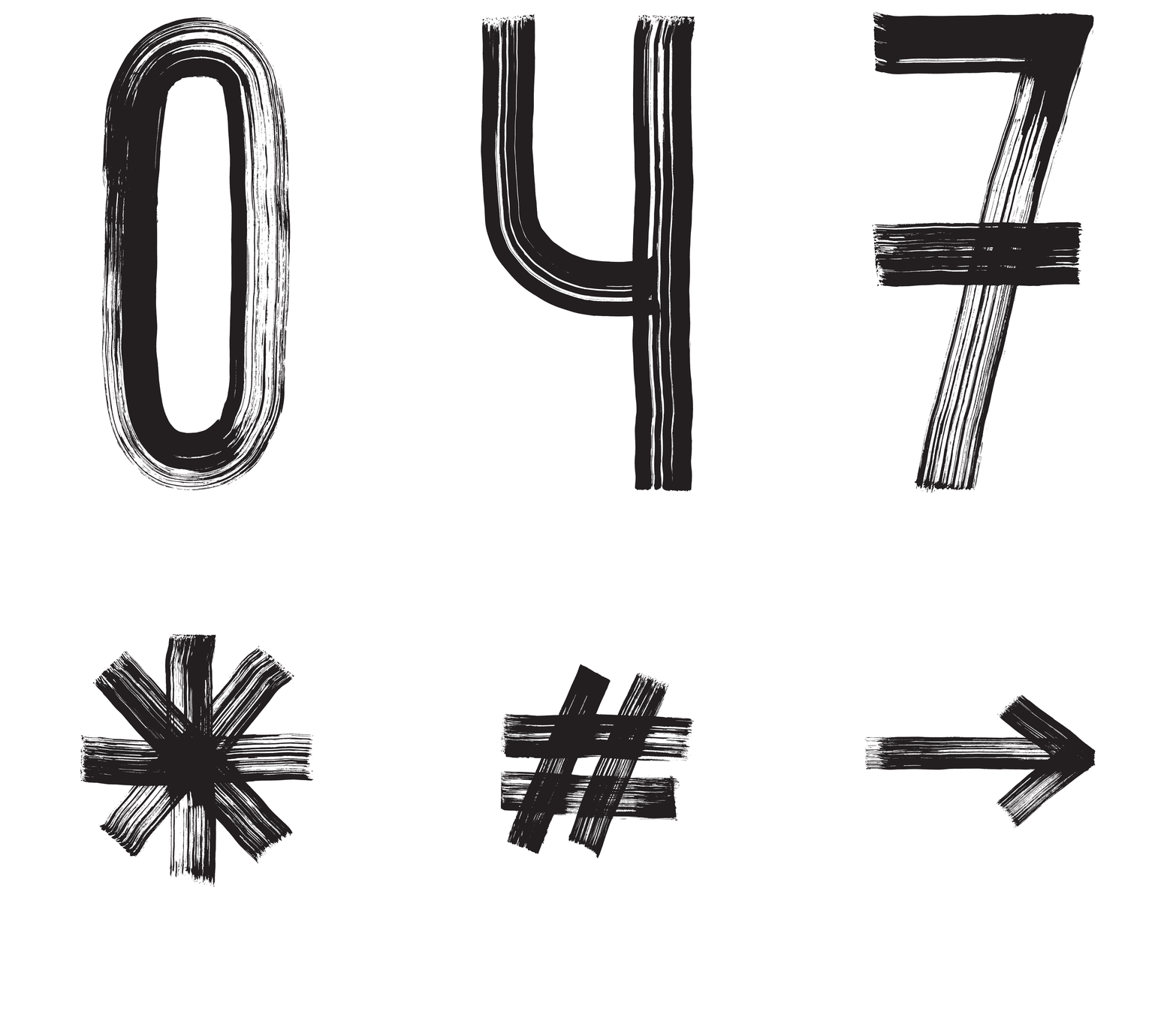
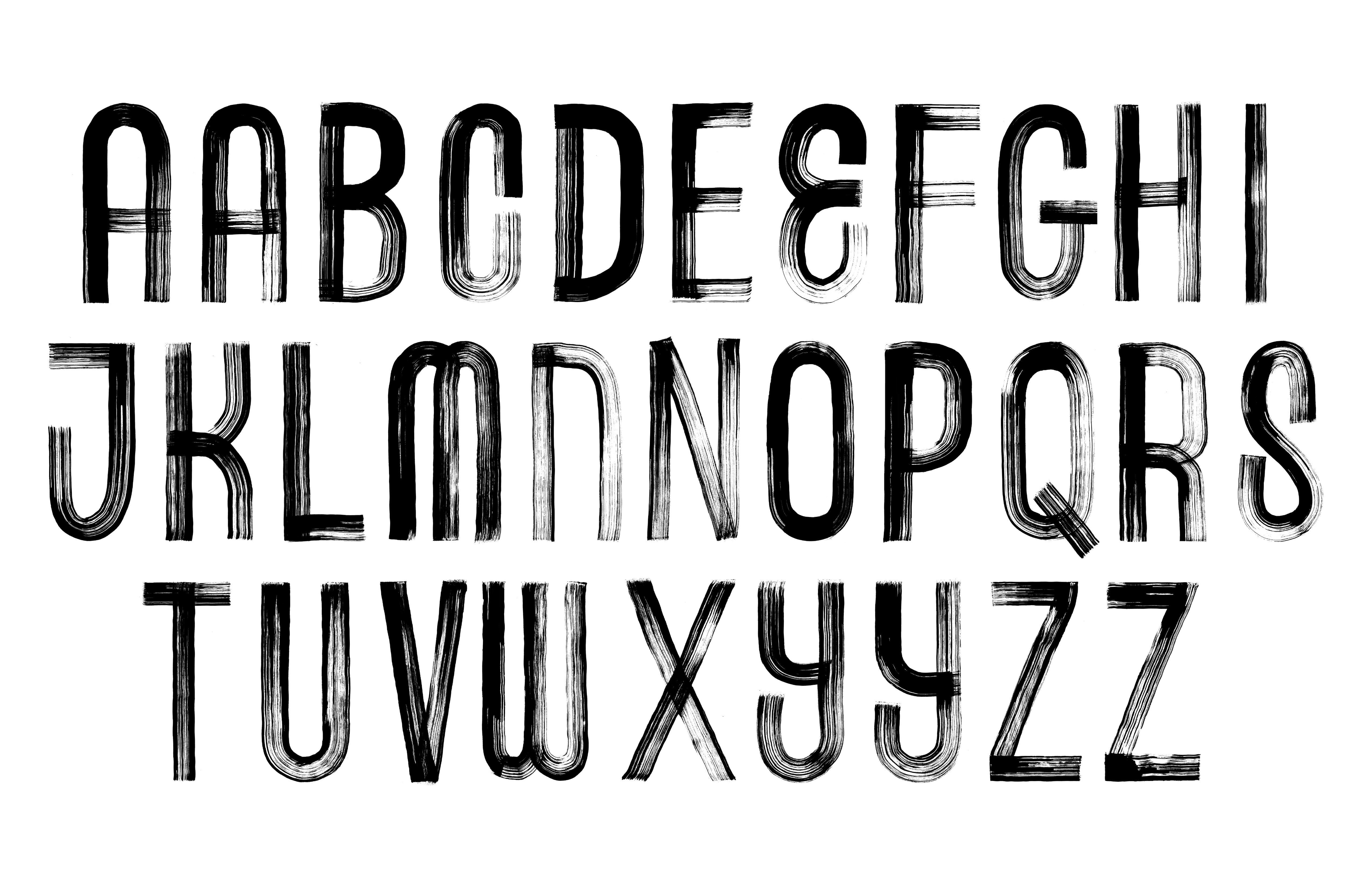
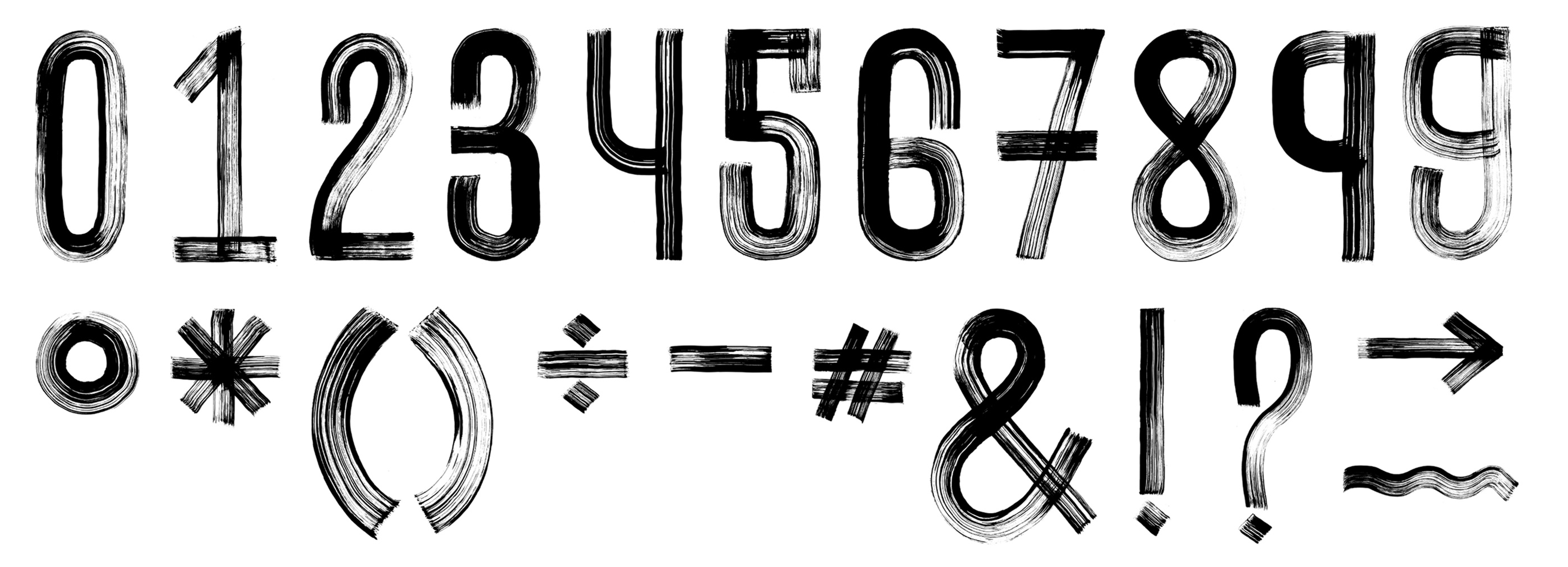
I used the toast as a tool, dipped it in ink and drew letterforms with it, even drew with the different sides of the toast. This experiment prompted me to use foam brushes and ink to mimic the same aesthetic that I was able to craft while drawing with the toast. The letterforms I was able to make through this process reflected a path that was unique and reflected the idea of a journey. I went ahead to create a display typeface using this tool that ultimately became the core element across all my brand applications. I scanned each character, cleaned and tweaked them digitally and then finally vectorized them so that they could be used on large scale applications seamlessly. As this was a hand-drawn typeface, I was able to create contextual alternates for several characters. This was an efficient tool to break the monotony and still retain the genuineness that comes from hand-crafting letterforms.


![]()
![]()
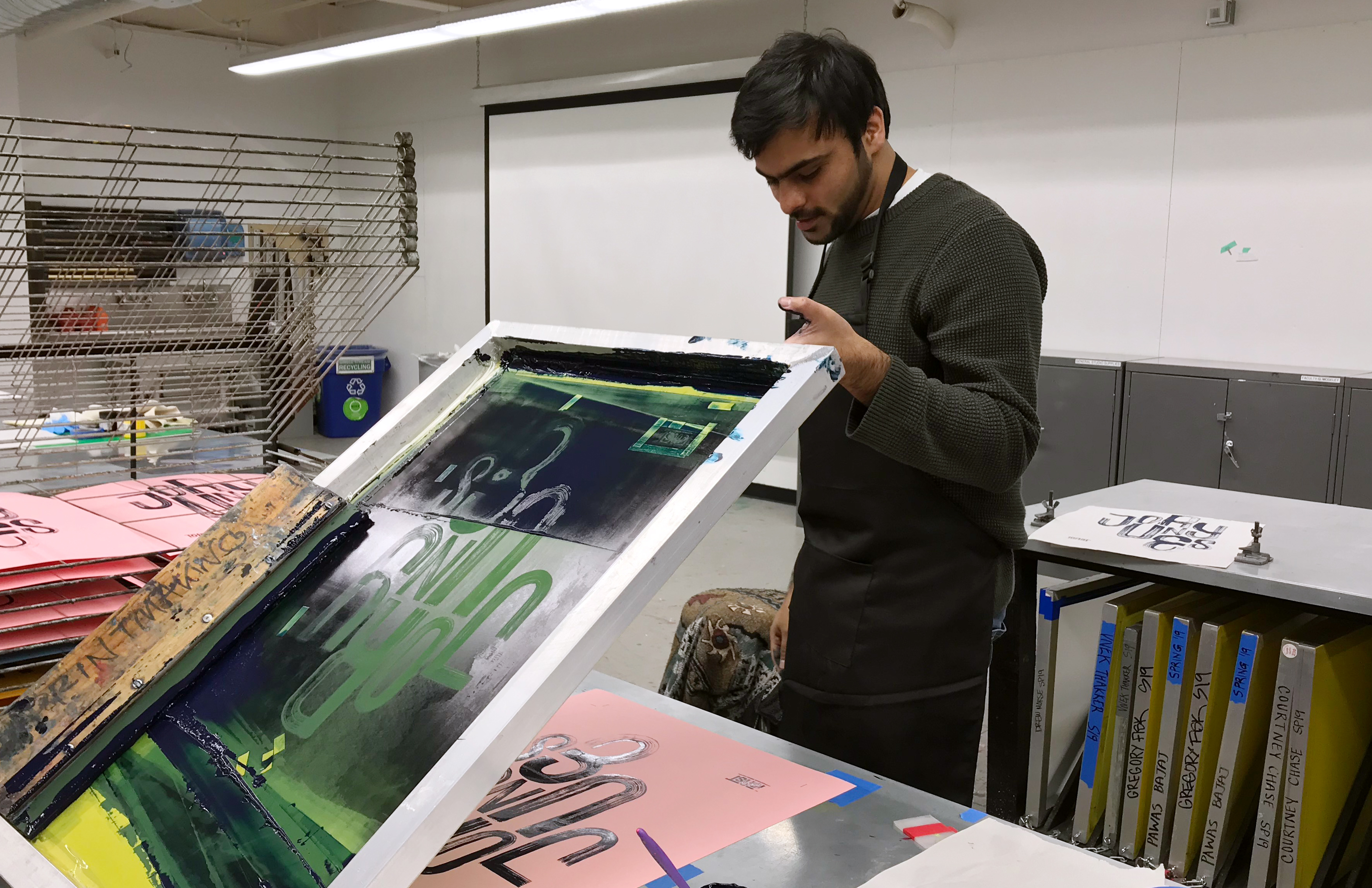
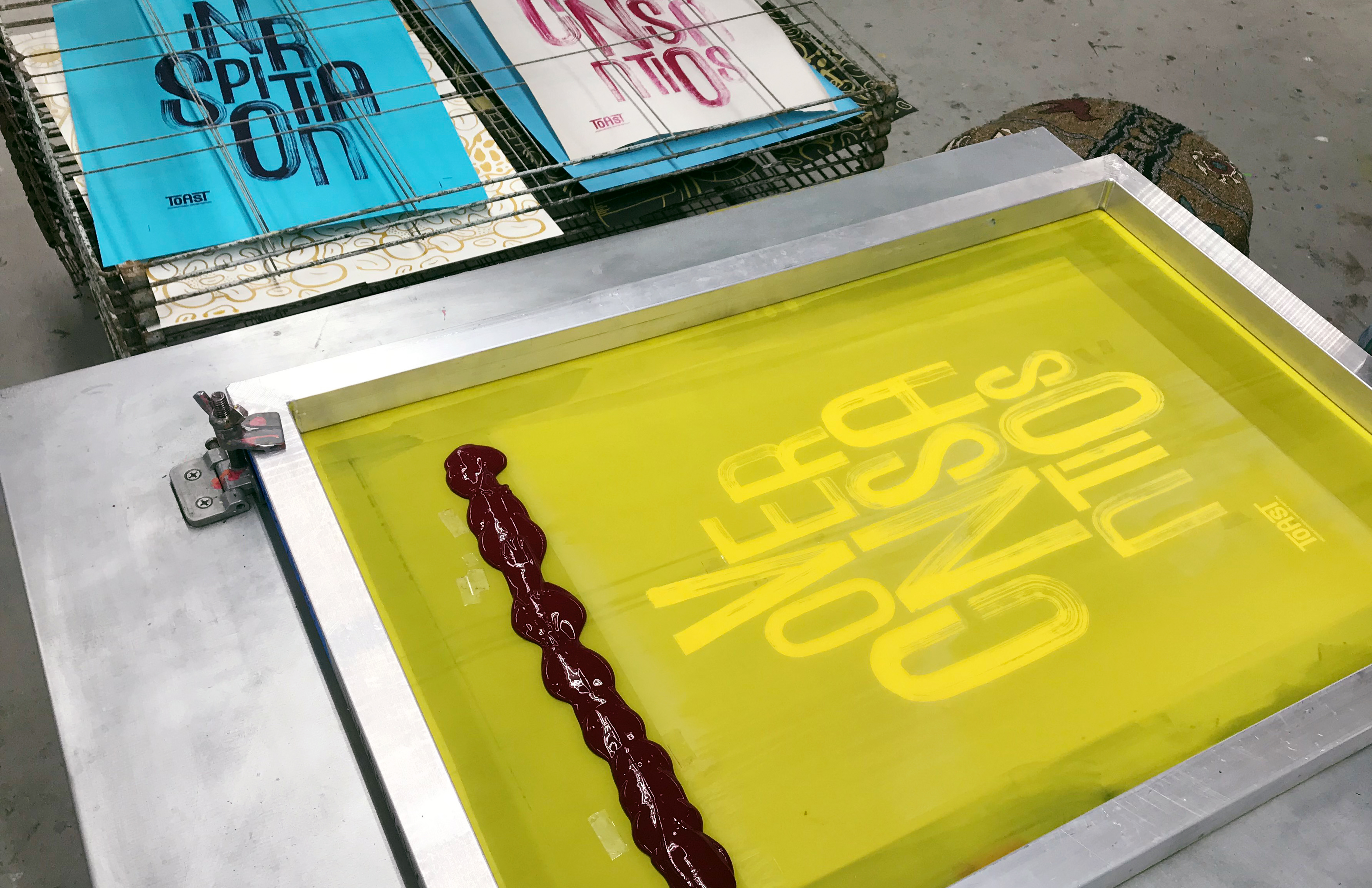
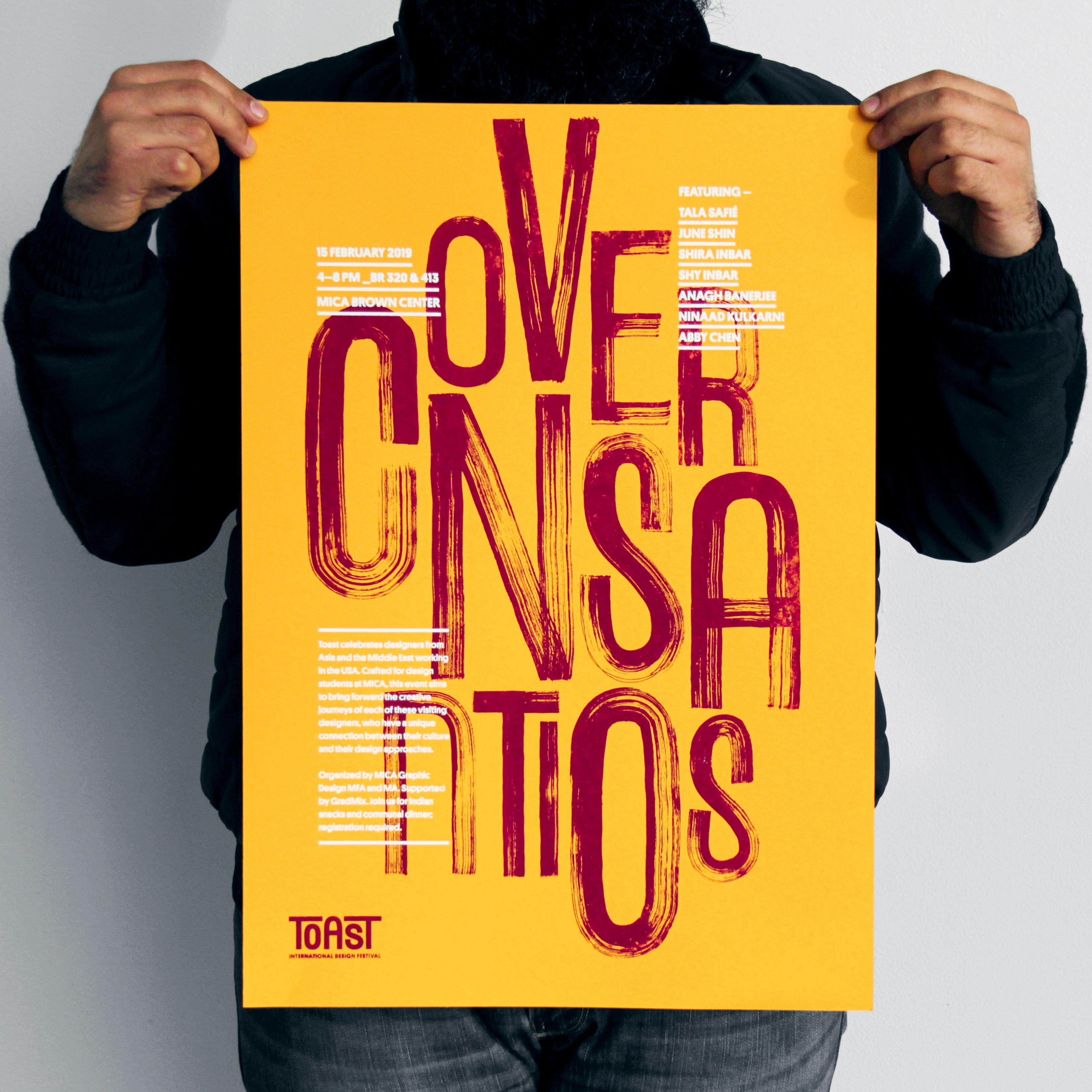
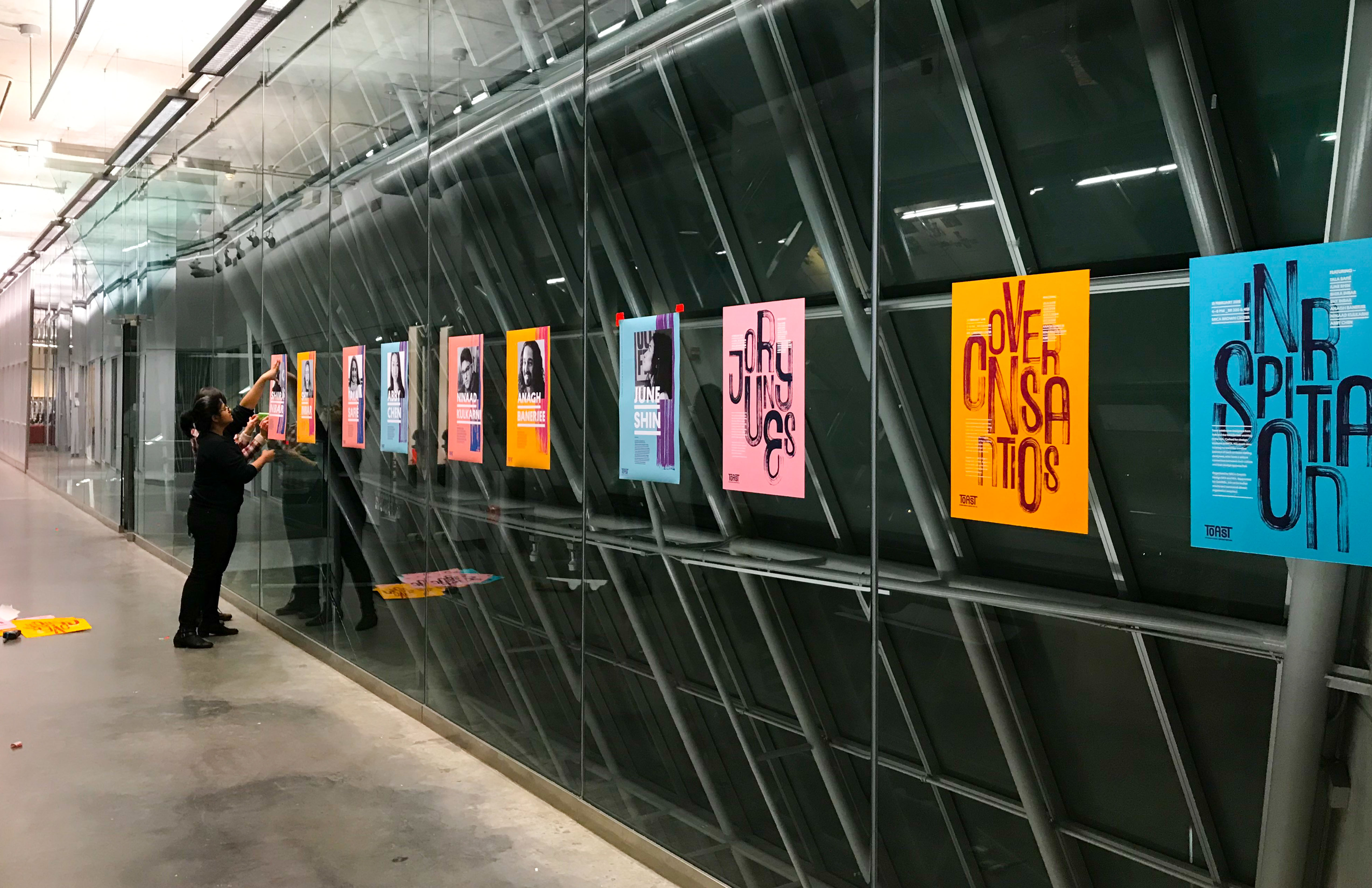
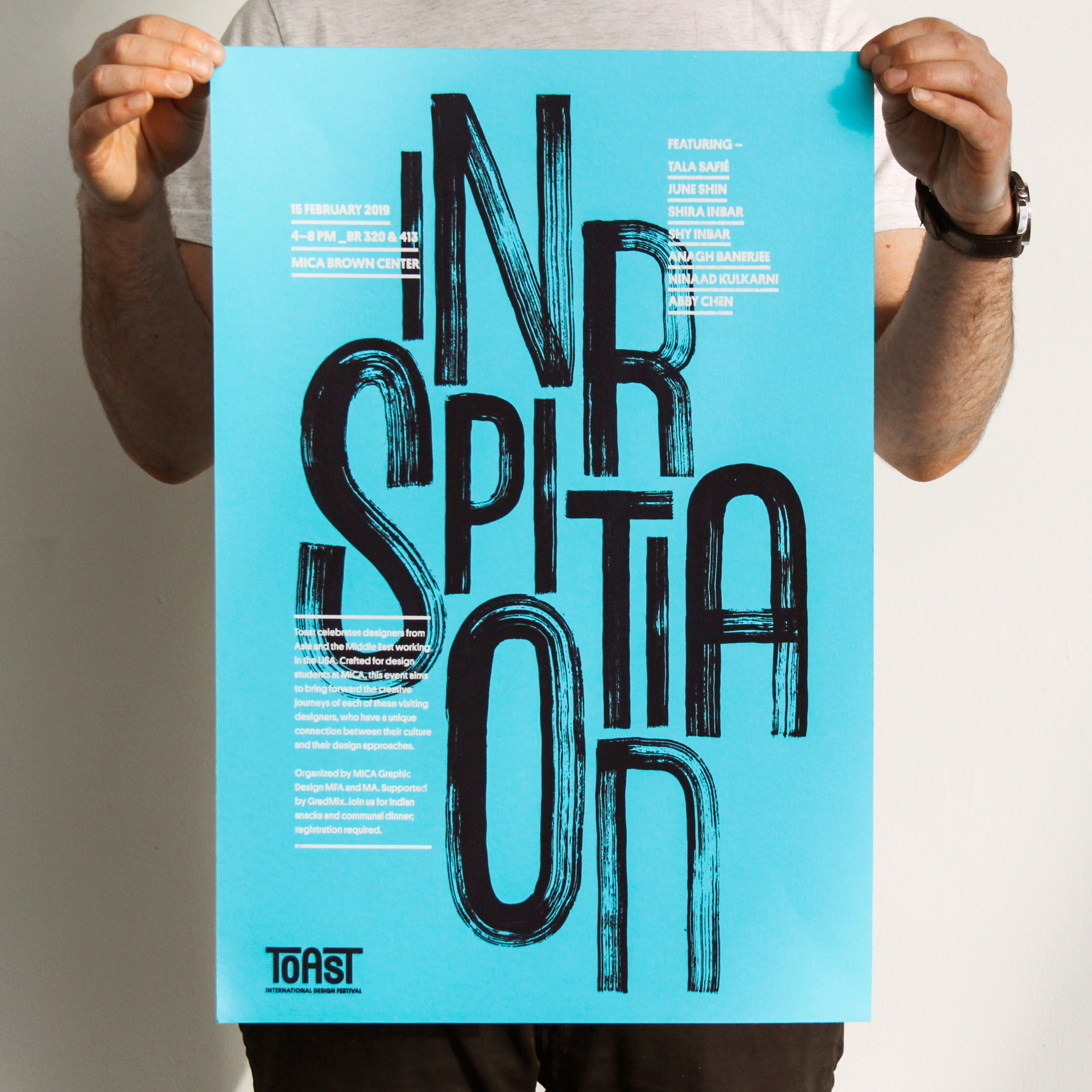
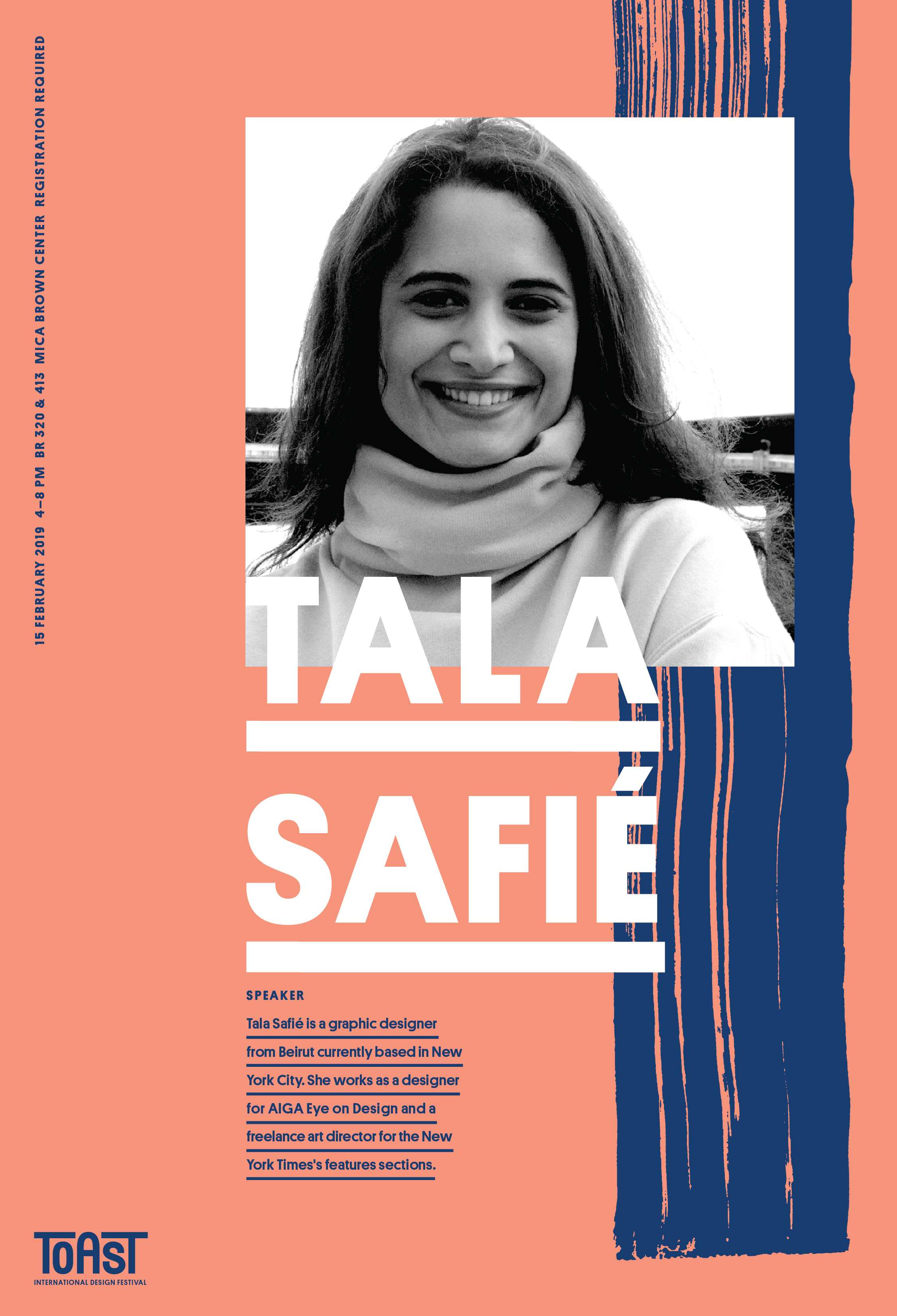
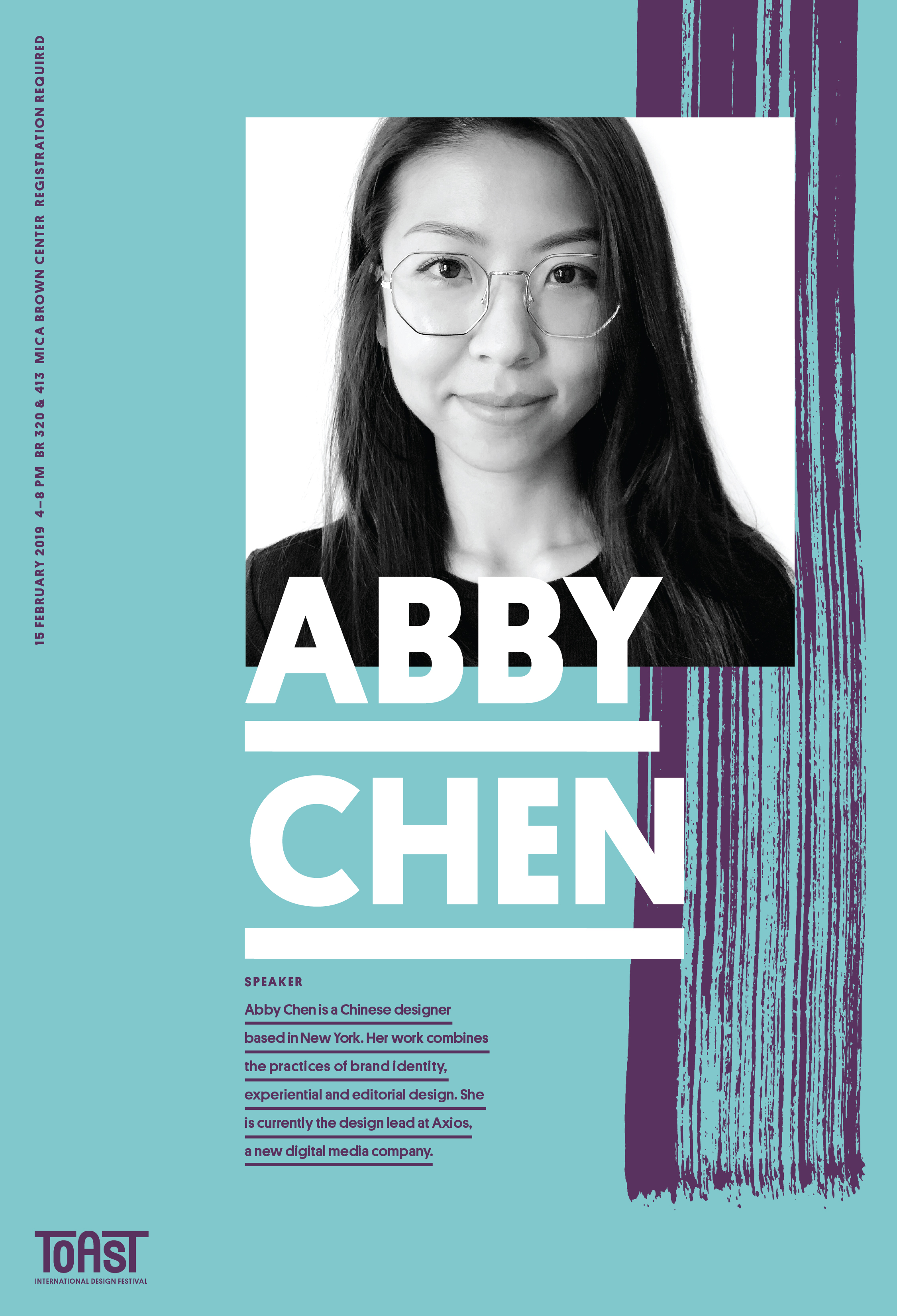
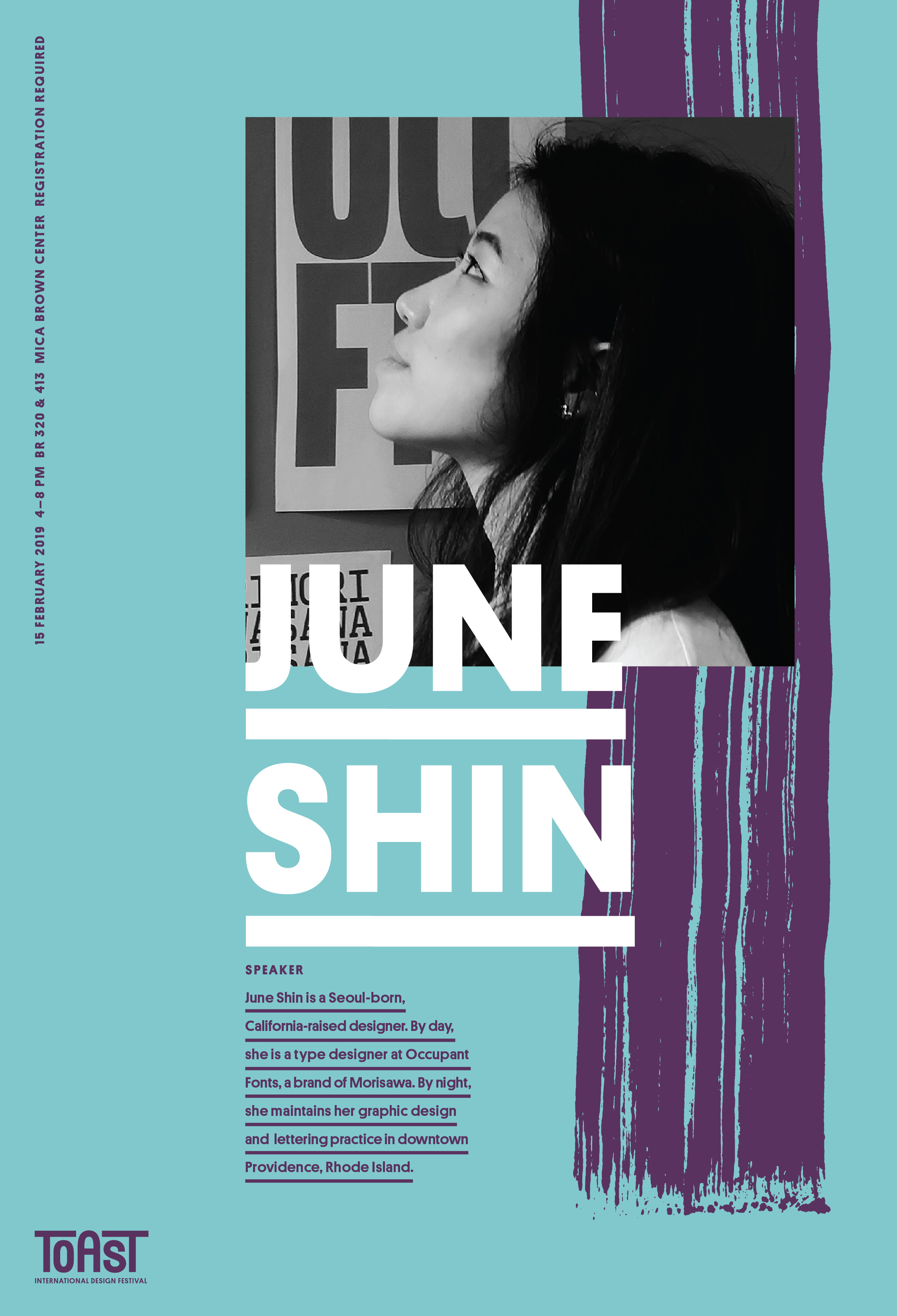
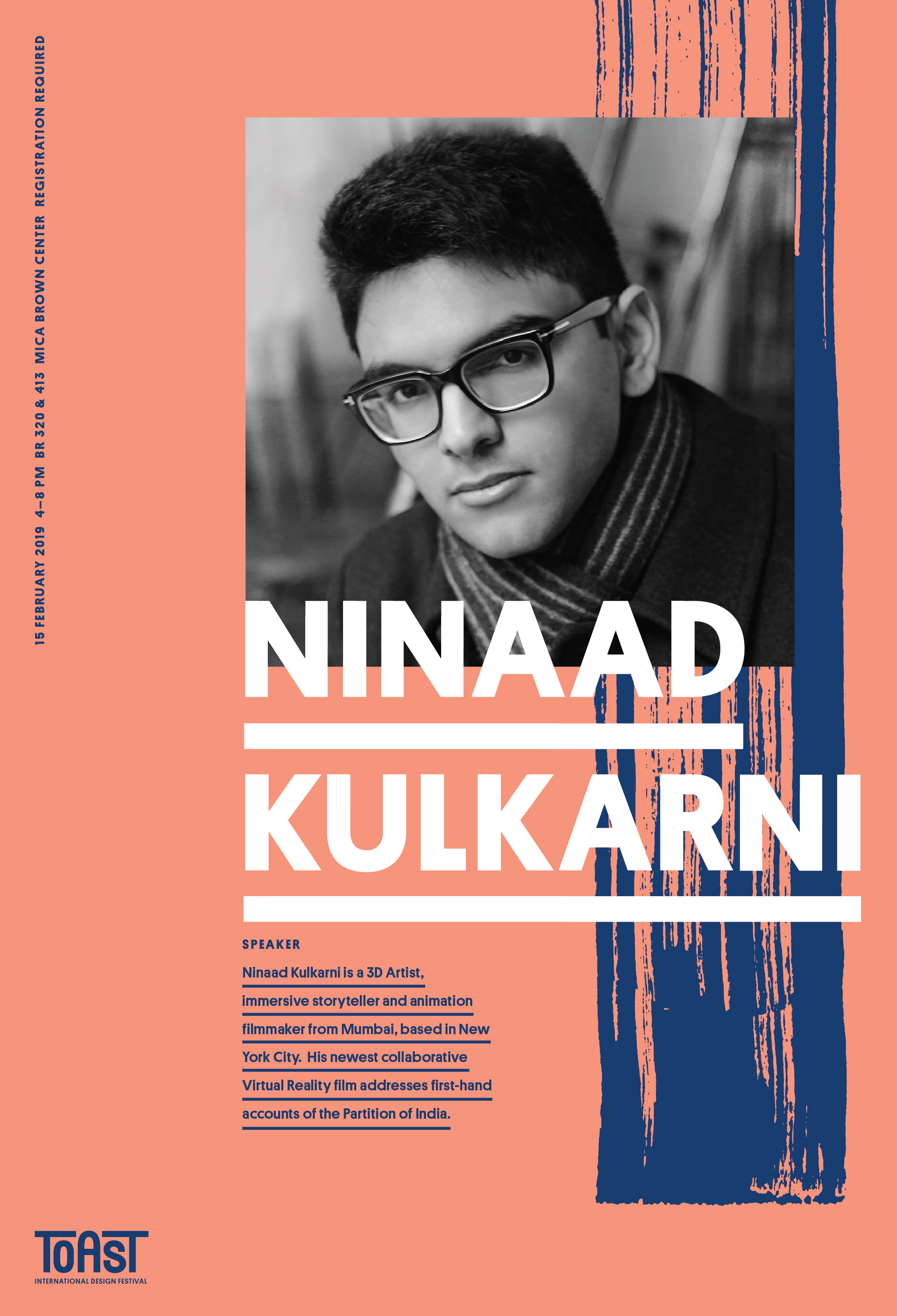
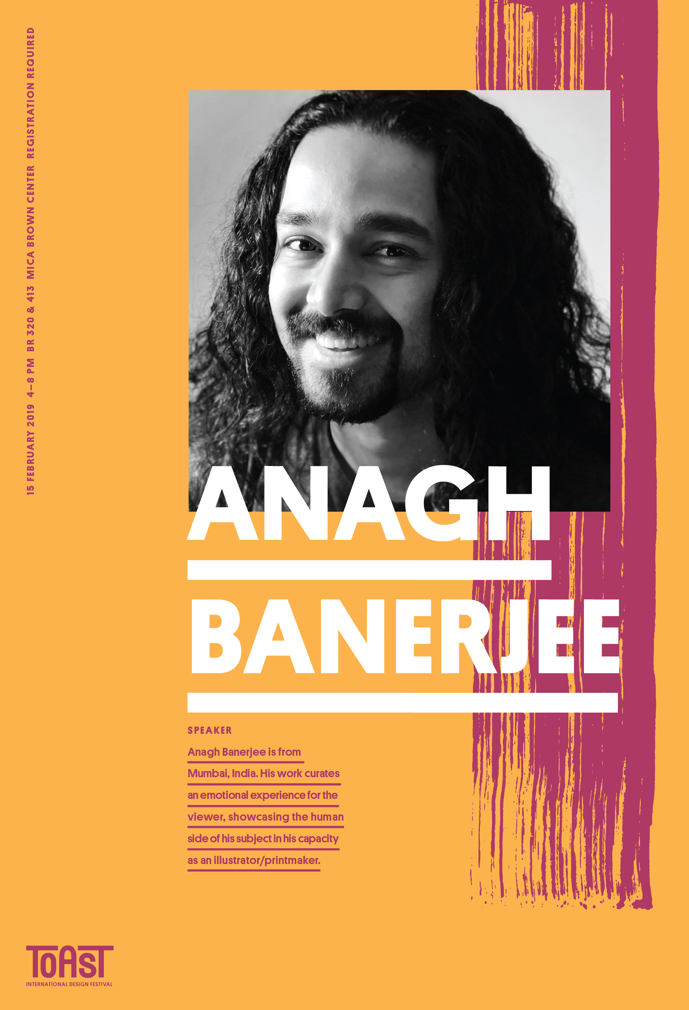
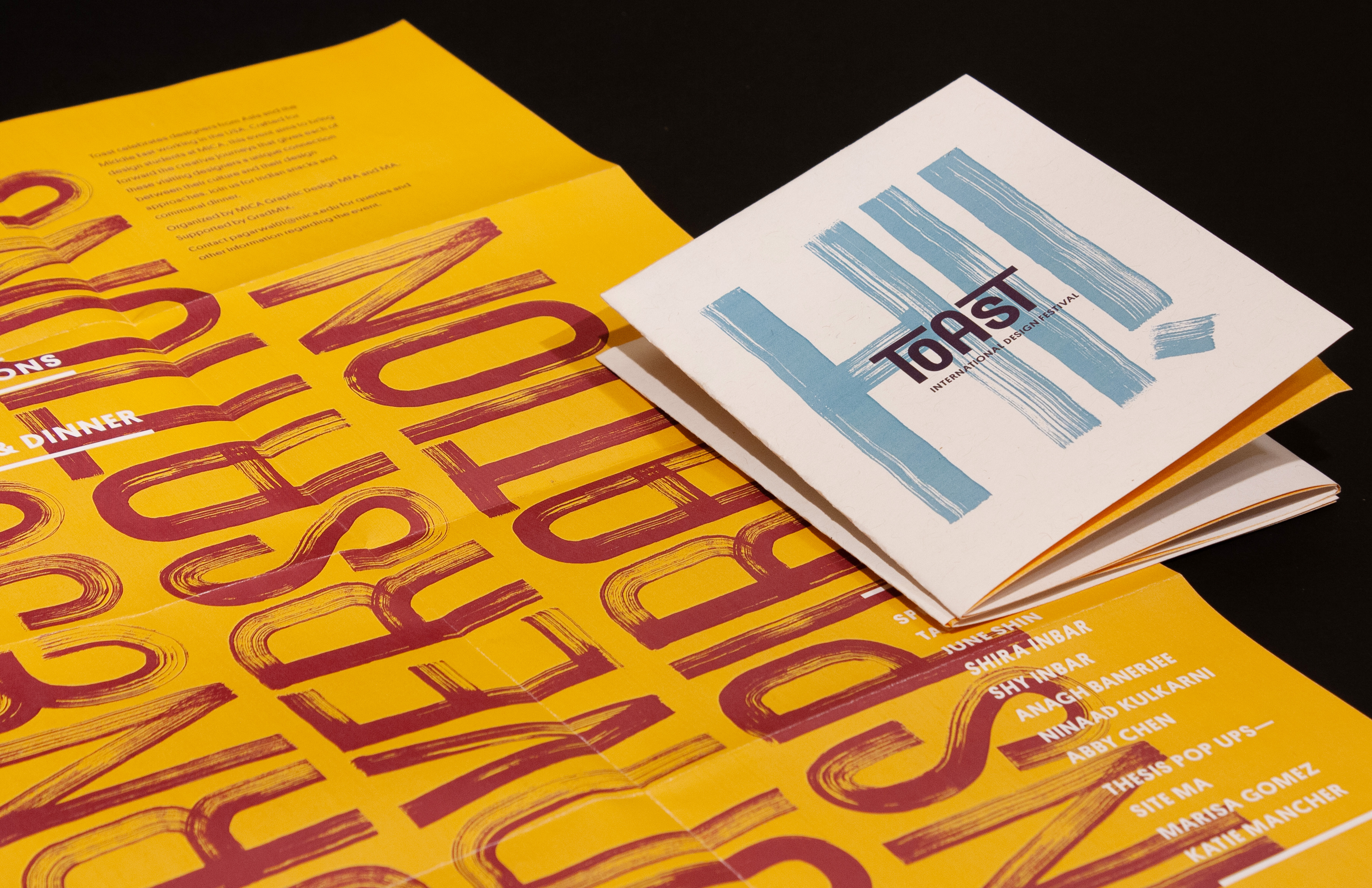
As a designer, I am fascinated by analog processes and mediums. I screen-printed posters which showcased the words' Journeys', 'Inspiration' and 'Conversations' as the central visual element. I also created a set of speaker posters that highlighted the crops of the handmade typeface as background element. These set of posters became an important part of the spatial experience on the day of the event.


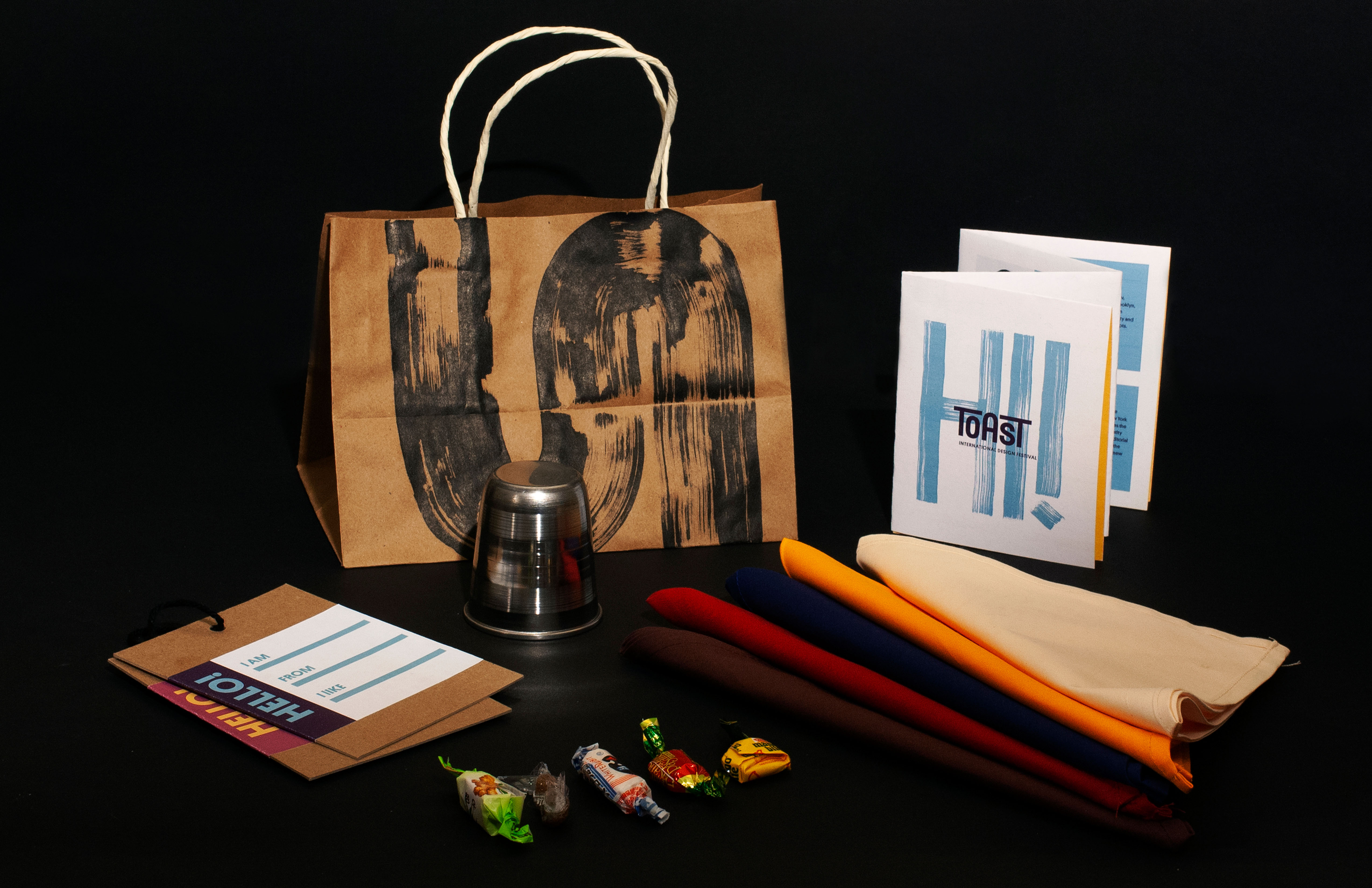
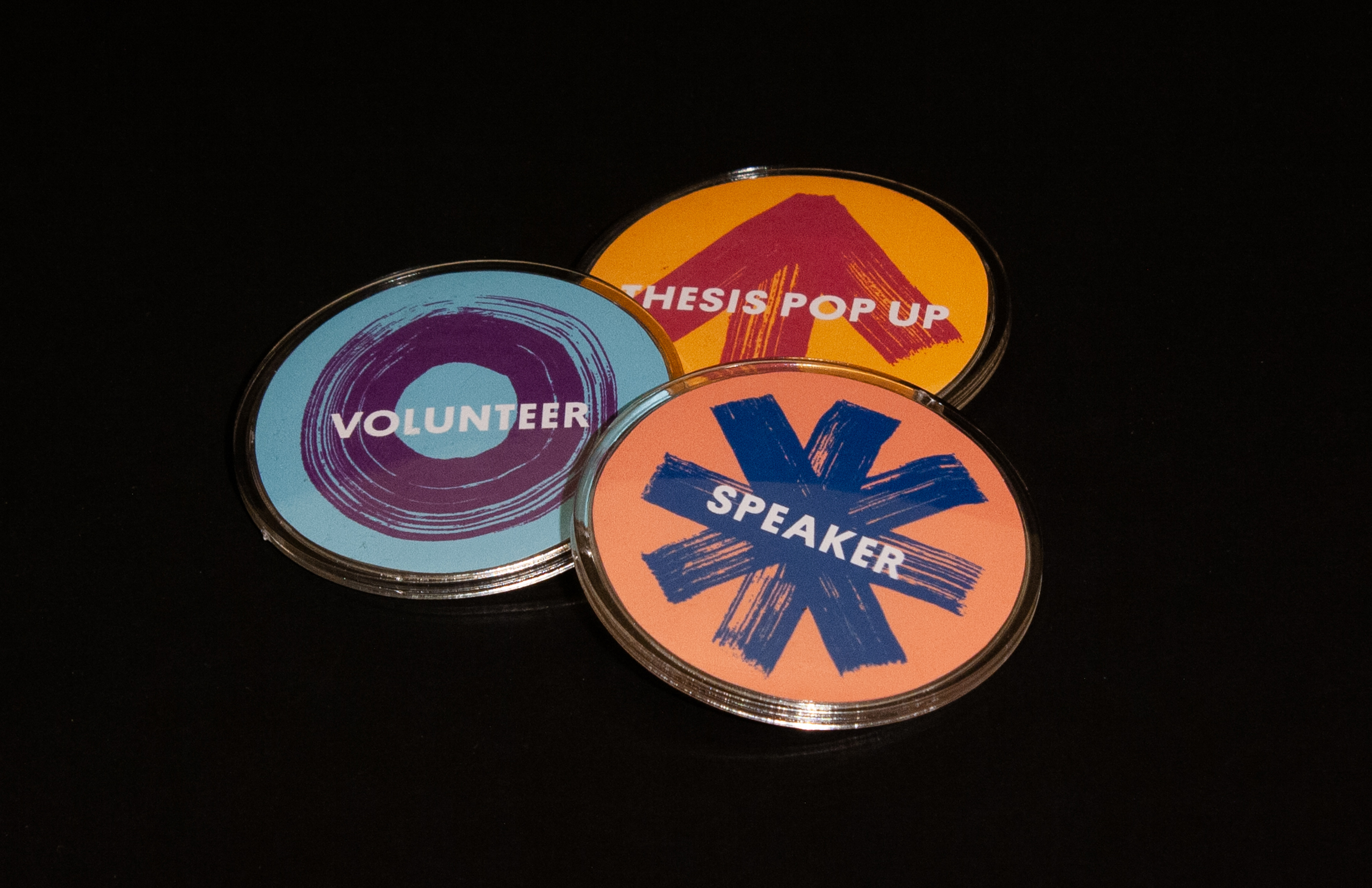
Takeaways are essential artifacts at any event or festival. As a host for Toast–International Design Festival, I designed a number of different items for all the attendees. A craft paper bag with a handmade brush stroke, an ID card, an aluminum glass as a memento, candy sourced from three different countries, the event schedule and a coloured handkerchief. I put together a hundred of these bags. These items live on even after the event, in people’s houses and memories. Each element was carefully planned and created by me to give the attendee an insight into different materials, textures, cultures, and contexts.
![]()


Eighty people attended the event. These were not just students and faculty, but even professionals, and people not associated with the field of design. I saw this as a great opportunity for all the attendees to truly interact, network and initiate conversations with each other. Each attendee got a small bag with some goodies, including a colored handkerchief. There were six colors for six tables at dinner. By providing this simple guideline, the attendees sat down for based on their allotted color. As these handkerchiefs were randomly assigned in their bags, this setting allowed people to talk to new people, including the speakers and the faculty. The interactions were informal but insightful for each participant in that space. The taste of the Channa Masala, Chicken Tikka and Garlic Naan were a catalyst to these conversations.
Project mentors: Ellen Lupton, Jason Gottlieb and Jennifer Cole Phillips.
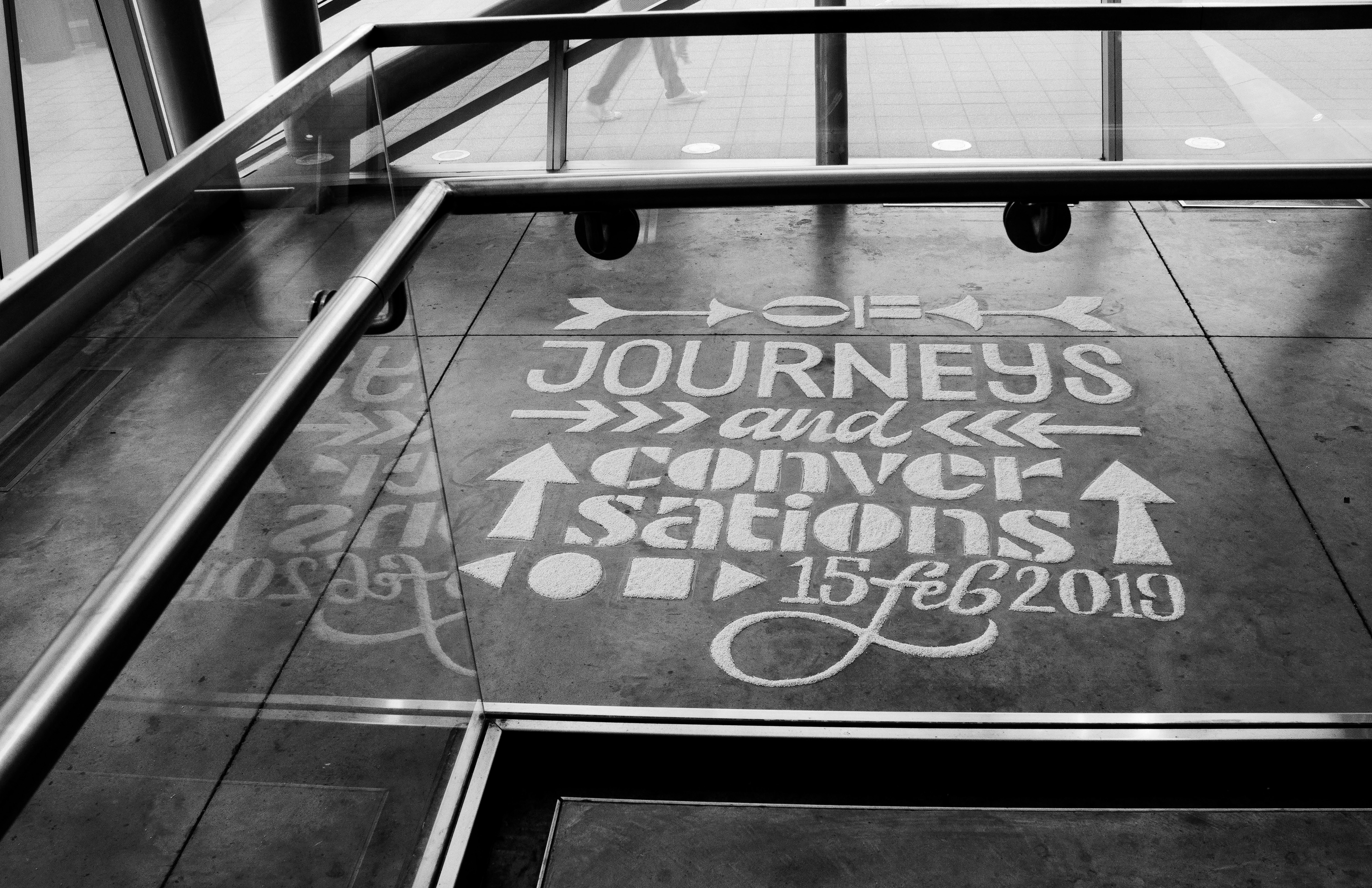
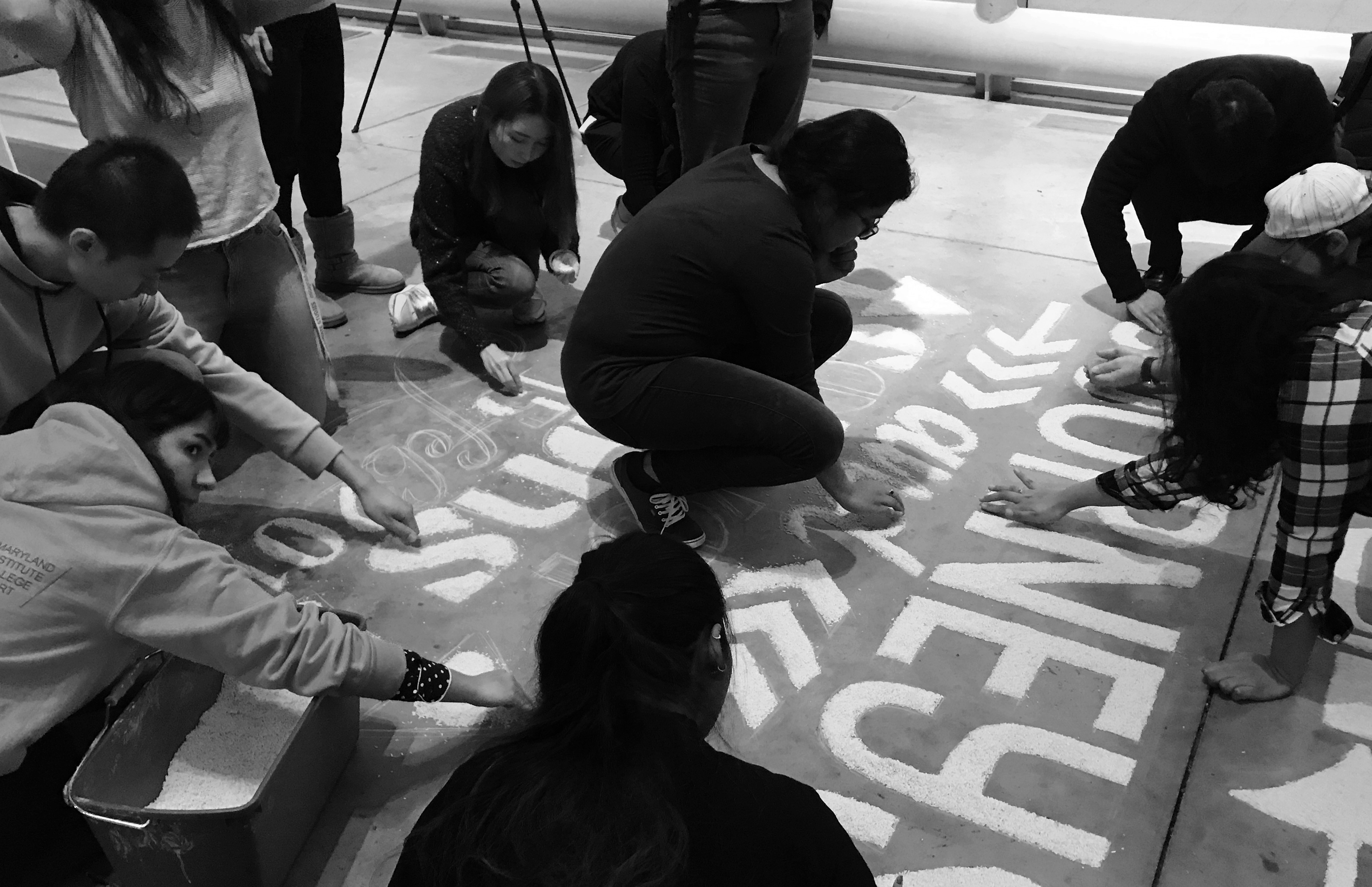
A build up or maintaining a buzz is very important for any festival or event. People use all kinds of techniques and methods to advertise, market and promote the event to the intended target audience. Keeping all these considerations in mind, I planned out a small teaser for my own event. Rangoli is an art form in India. Patterns are made on the ground using rice, sand or flower petals. Different members of the family come together to create this artwork on auspicious days such as Diwali. I used this medium and combined it with typography to create a promotional installation for my thesis. By looking at this traditional art form through a contemporary lens, I have tried to adapt it to a different context while it still retains the original intention of marking a celebration. Based on a grid I sketched with chalk, My GDMFA family at MICA came together to fill In the outlines with rice as a collaborative exercise.


Food is a powerful tool that binds many cultures together. I wanted to choose a single food item or dish that would cater to that purpose. A toast is a perfect example. Simple yet diverse, this food item is integral to almost every cuisine in the world. I used this as the central theme for my event, allowing me to structure all my visual explorations around this food item.

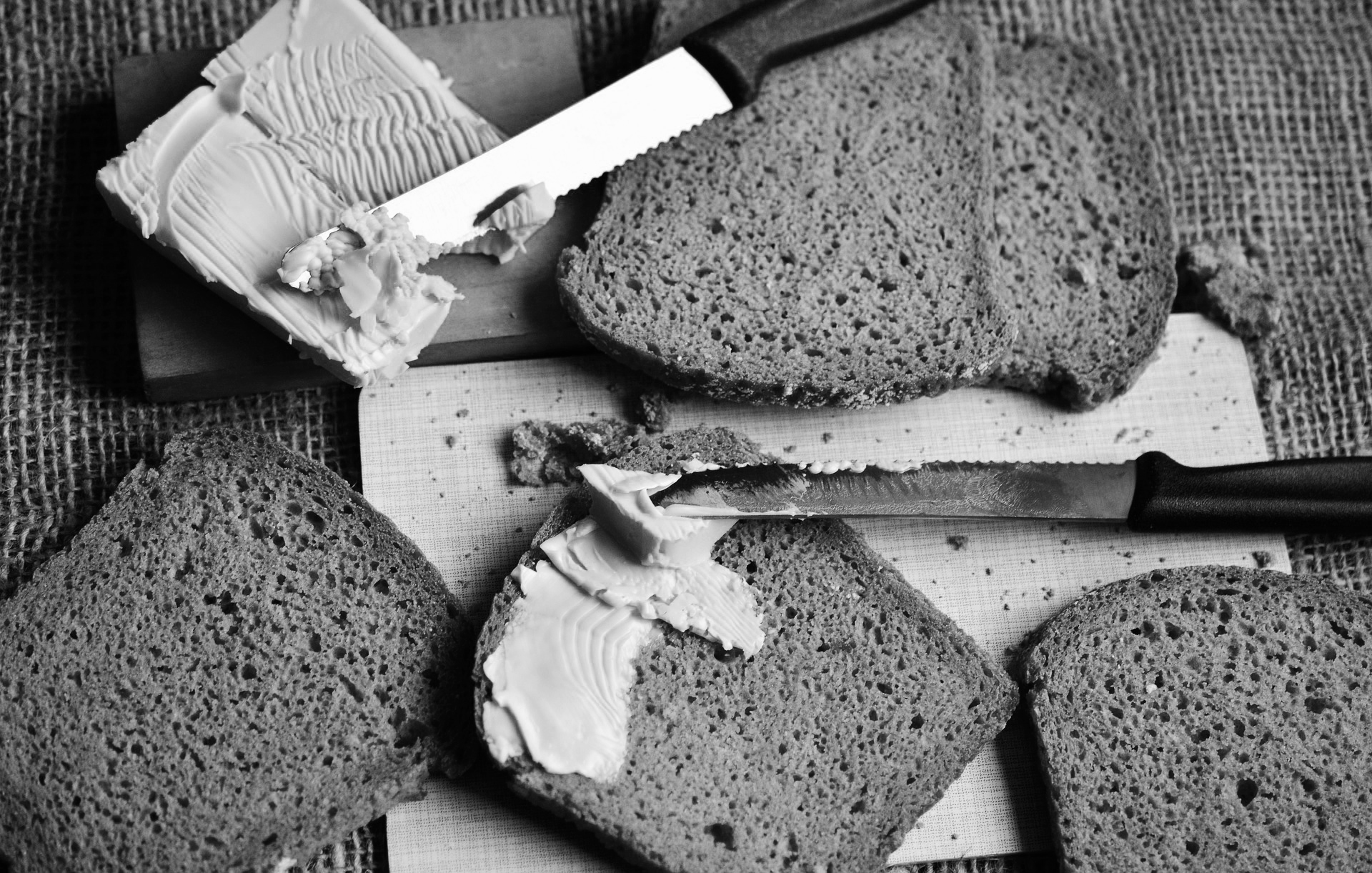

My first approach towards visually representing this idea was a very literal interpretation of the word ‘toast’. I carved out letterforms from toast and applied various condiments to spell out the word 'Journeys'. Even though this was visually engaging, this approach seemed limiting and not diverse enough for an identity system and its applications.

I used the toast as a tool, dipped it in ink and drew letterforms with it, even drew with the different sides of the toast. This experiment prompted me to use foam brushes and ink to mimic the same aesthetic that I was able to craft while drawing with the toast. The letterforms I was able to make through this process reflected a path that was unique and reflected the idea of a journey. I went ahead to create a display typeface using this tool that ultimately became the core element across all my brand applications. I scanned each character, cleaned and tweaked them digitally and then finally vectorized them so that they could be used on large scale applications seamlessly. As this was a hand-drawn typeface, I was able to create contextual alternates for several characters. This was an efficient tool to break the monotony and still retain the genuineness that comes from hand-crafting letterforms.

As a designer, I am fascinated by analog processes and mediums. I screen-printed posters which showcased the words' Journeys', 'Inspiration' and 'Conversations' as the central visual element. I also created a set of speaker posters that highlighted the crops of the handmade typeface as background element. These set of posters became an important part of the spatial experience on the day of the event.





Takeaways are essential artifacts at any event or festival. As a host for Toast–International Design Festival, I designed a number of different items for all the attendees. A craft paper bag with a handmade brush stroke, an ID card, an aluminum glass as a memento, candy sourced from three different countries, the event schedule and a coloured handkerchief. I put together a hundred of these bags. These items live on even after the event, in people’s houses and memories. Each element was carefully planned and created by me to give the attendee an insight into different materials, textures, cultures, and contexts.

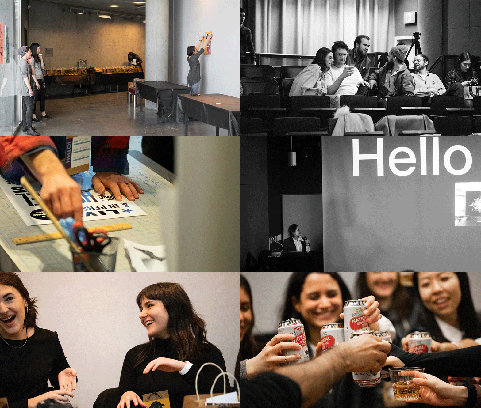

Eighty people attended the event. These were not just students and faculty, but even professionals, and people not associated with the field of design. I saw this as a great opportunity for all the attendees to truly interact, network and initiate conversations with each other. Each attendee got a small bag with some goodies, including a colored handkerchief. There were six colors for six tables at dinner. By providing this simple guideline, the attendees sat down for based on their allotted color. As these handkerchiefs were randomly assigned in their bags, this setting allowed people to talk to new people, including the speakers and the faculty. The interactions were informal but insightful for each participant in that space. The taste of the Channa Masala, Chicken Tikka and Garlic Naan were a catalyst to these conversations.