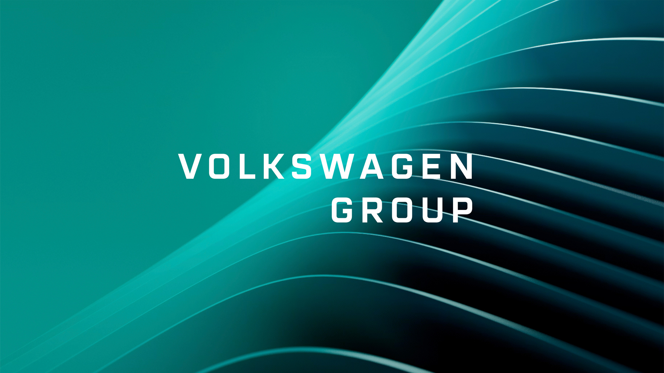
Volkswagen Group —
Where Mobility becomes a Progressive Force.
Volkswagen Group’s transformation began with a name change – swapping ‘Aktiengesellschaft’ for ‘Group’ to signal clarity, cohesion and a global mindset. But the old identity still spoke in the language of the past. To reflect its shift from traditional automaker to tech-driven mobility leader, the Group needed a brand that could unite 12 marques, inspire 680,000 employees, and speak to investors, governments, NGOs and customers alike.
The task? Create a bold new identity that resonates with the future and announces this change, while following the strategic mission closely. The change in name from Volkswagen Aktiengesellschaft to Volkswagen Group was a pivotal starting point for this transition.
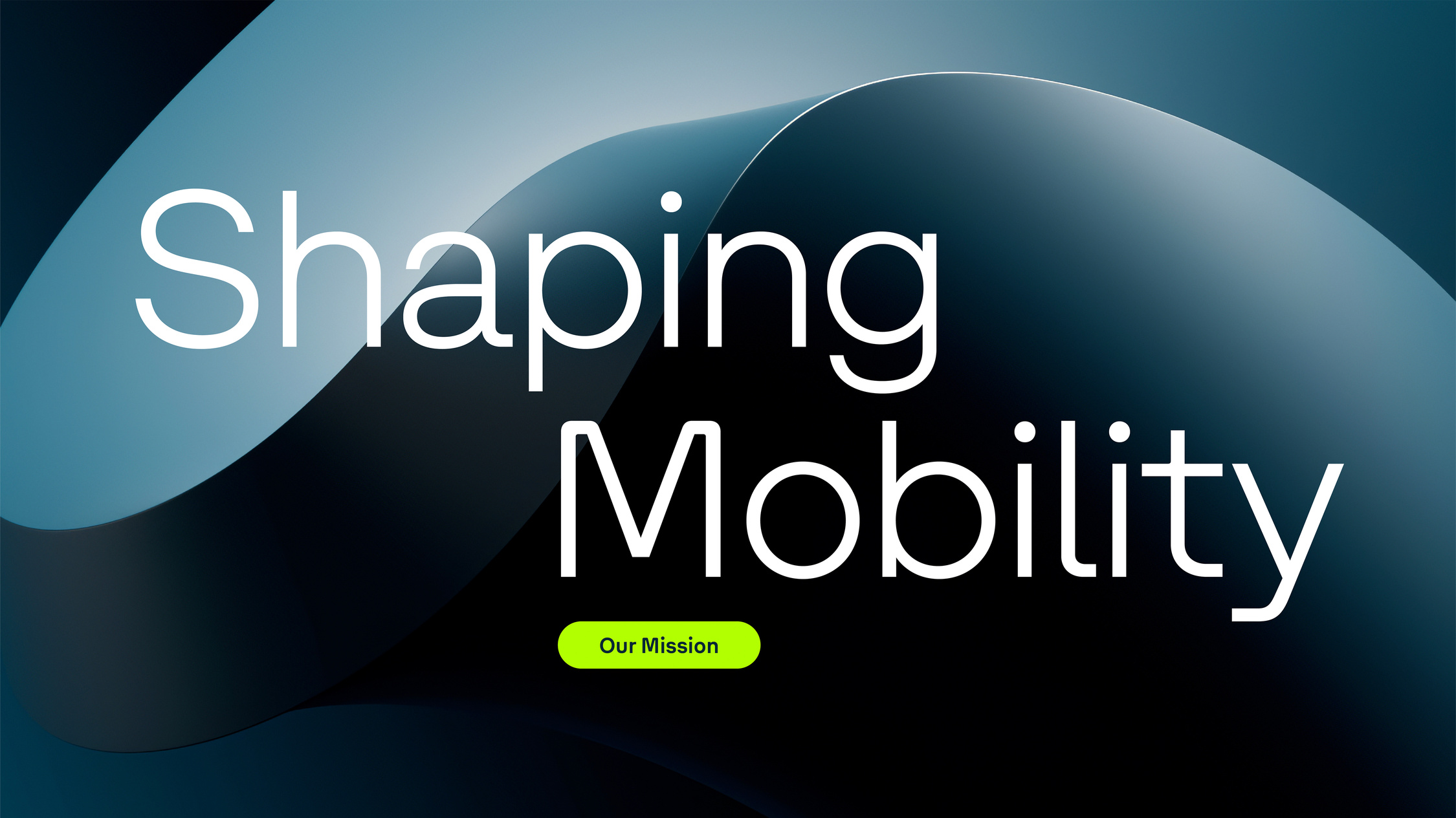
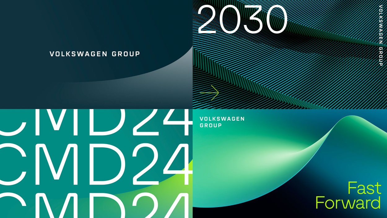
Informed by the mission statement “Shaping Mobility for Generations to Come”, “Progressive Movement” emerged as the guiding principle, symbolizing fluidity, boundless potential, and a constant push forward. It became the core element for the vibrant new identity. The new distinct design system informed by the strategic vision, unlocks the power of design across all touchpoints and applications.
The task? Create a bold new identity that resonates with the future and announces this change, while following the strategic mission closely. The change in name from Volkswagen Aktiengesellschaft to Volkswagen Group was a pivotal starting point for this transition.
Informed by the mission statement “Shaping Mobility for Generations to Come”, “Progressive Movement” emerged as the guiding principle, symbolizing fluidity, boundless potential, and a constant push forward. It became the core element for the vibrant new identity. The new distinct design system informed by the strategic vision, unlocks the power of design across all touchpoints and applications.

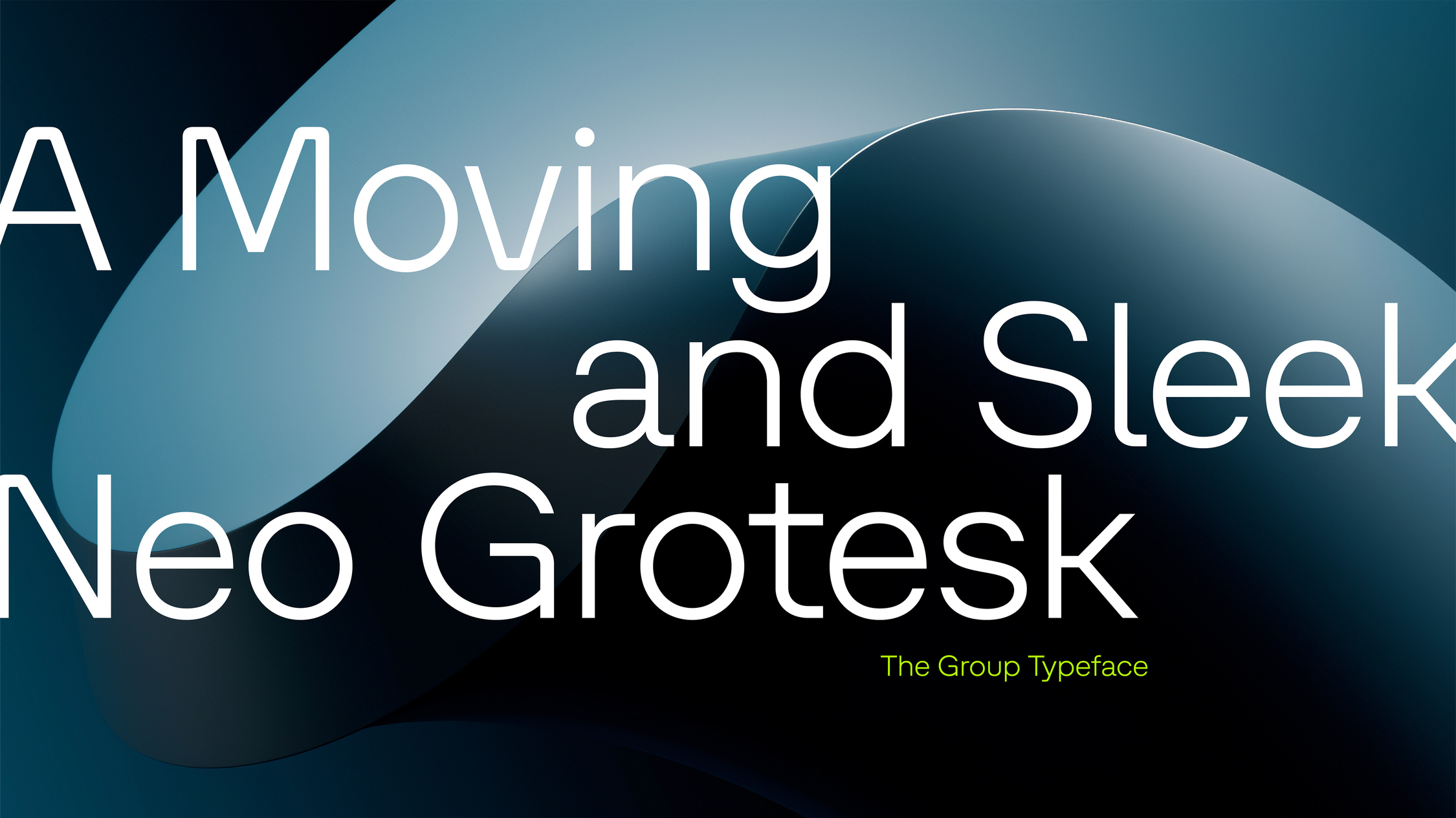
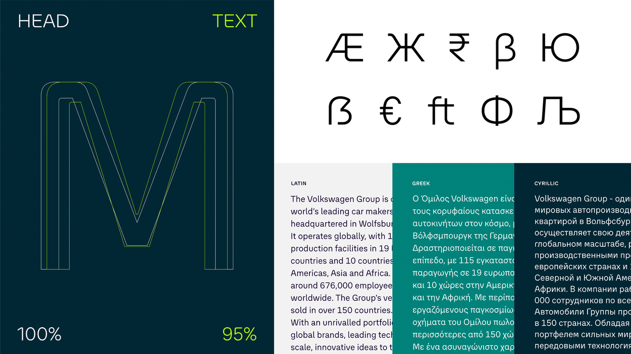
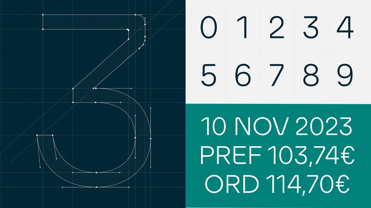
The newly created wordmark served as direct inspiration for the DNA of the font family. Distinctive features, such asthe rounded corner elements of “O”, the middle-bar of “K”, and the terminals of “S” were incorporated into the typeface and consistently developed further. It acts as a powerful and defining asset, projecting a strong brand image to the world and renewed sense of unity and inspiration internally. The typeface was developed in collaboration with Studio René Bieder. The new modular design system and assets leverage brand equity. This allows for flexible use across all physical and digital touchpoints.


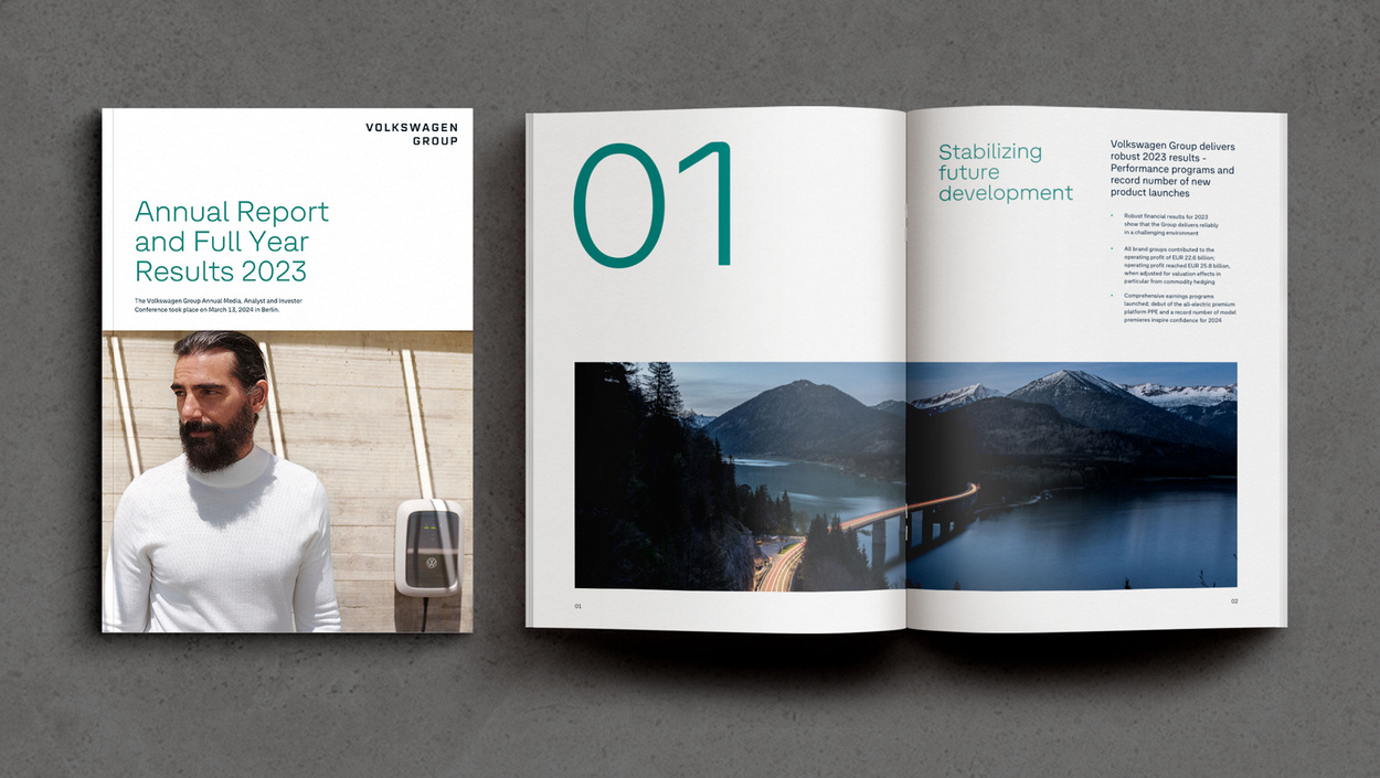
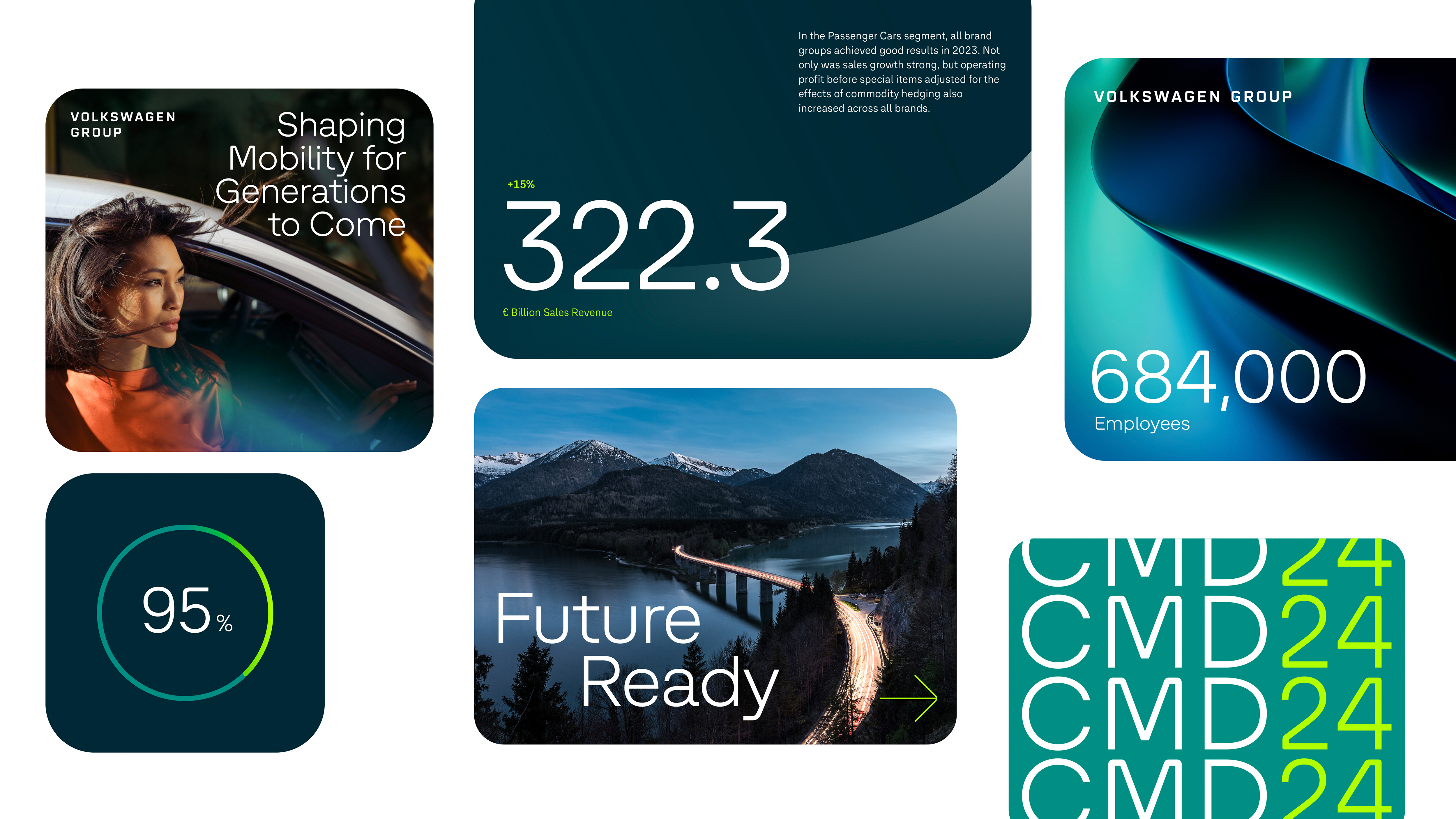
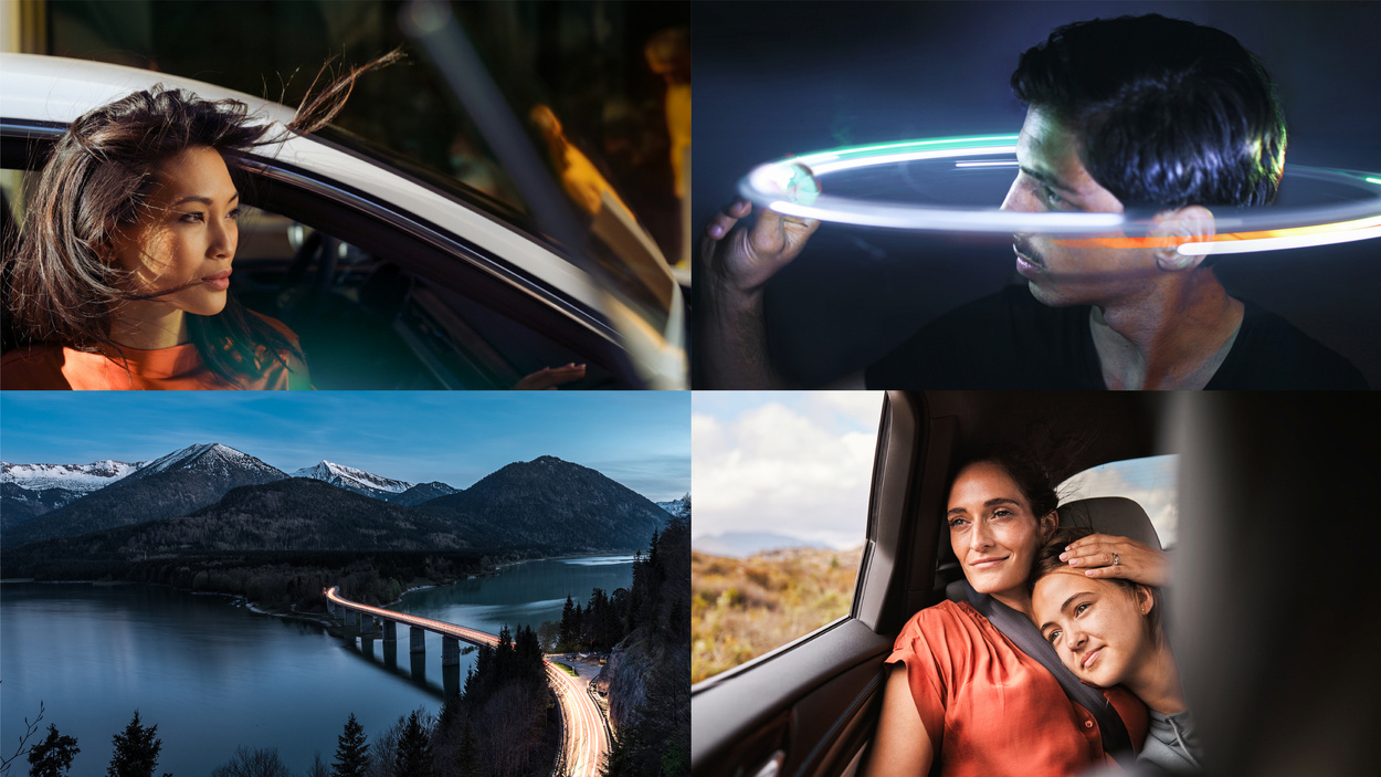
This project went beyond a simple identity refresh, actively empowering a complex global business. We unified more than 20 individual brands, over 680,000 employees, and a range of diverse stakeholders under one cohesive corporate identity. Design galvanized a shared vision, enabling people to truly resonate with Volkswagen Group’s bold shift toward sustainable, tech-driven mobility leadership. We have imagined, influenced and reinvented what a global holding company can achieve through design.
“Our new Corporate Design supports us in visually underlining the Group’s new strategic goals and contents. The new look creates high recognition value, is modern and forward-looking.” - Oliver Blume, Volkswagen Group, CEO
Worked with
Landor
Client
Volkswagen Group
Creative Tasks
Creative Direction
Brand Concept & Guidelines
Design Team
Pragun Agarwal
Markus Blankenburg
Philipp Nottelmann
Luna Wang
René Bieder
Market
Automotive, Technology
Image & Content Credits
Landor
Landor
Client
Volkswagen Group
Creative Tasks
Creative Direction
Brand Concept & Guidelines
Design Team
Pragun Agarwal
Markus Blankenburg
Philipp Nottelmann
Luna Wang
René Bieder
Market
Automotive, Technology
Image & Content Credits
Landor
2024 Red Dot Winner / Corporate Design & Identity
2024 Red Dot Winner / Typeface
2024 Corporate Design Preis / Corporate Design Relaunch
2024 Corporate Design Preis / Corporate Typography
2025 iF Design Gold / Typography / Signage
2025 Transform Awards Europe
- Gold / Best Brand Development to Reflect Change of Mission
- Gold / Best Visual Identity from the Automotive Sector
- Gold / Best Brand Evolution
- Silver / Best Use of Typography
- Silver / Best Brand Experience