Wildcraft
Client: Wildcraft | Worked with: Codesign | Images And Content Credits: Codesign
Project Team: Rajesh Dahiya, Mohor Ray Dahiya, Vivek Sadamate and Pragun Agarwal.
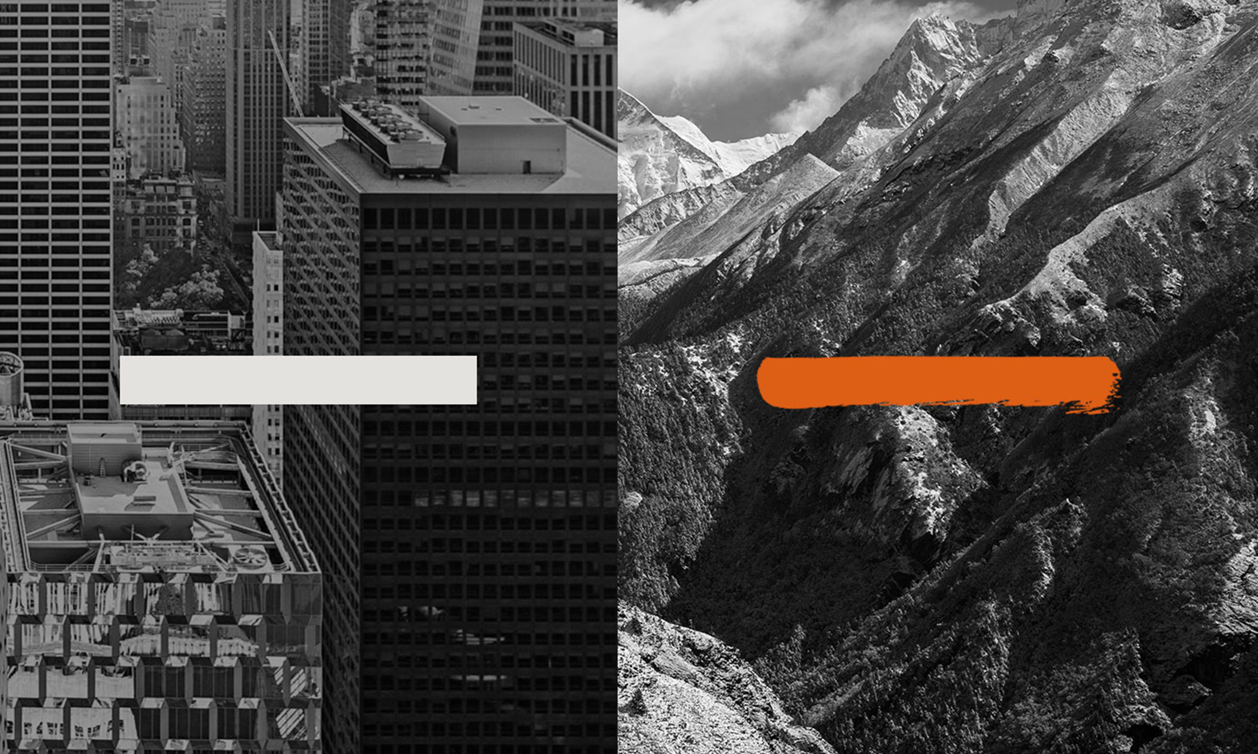
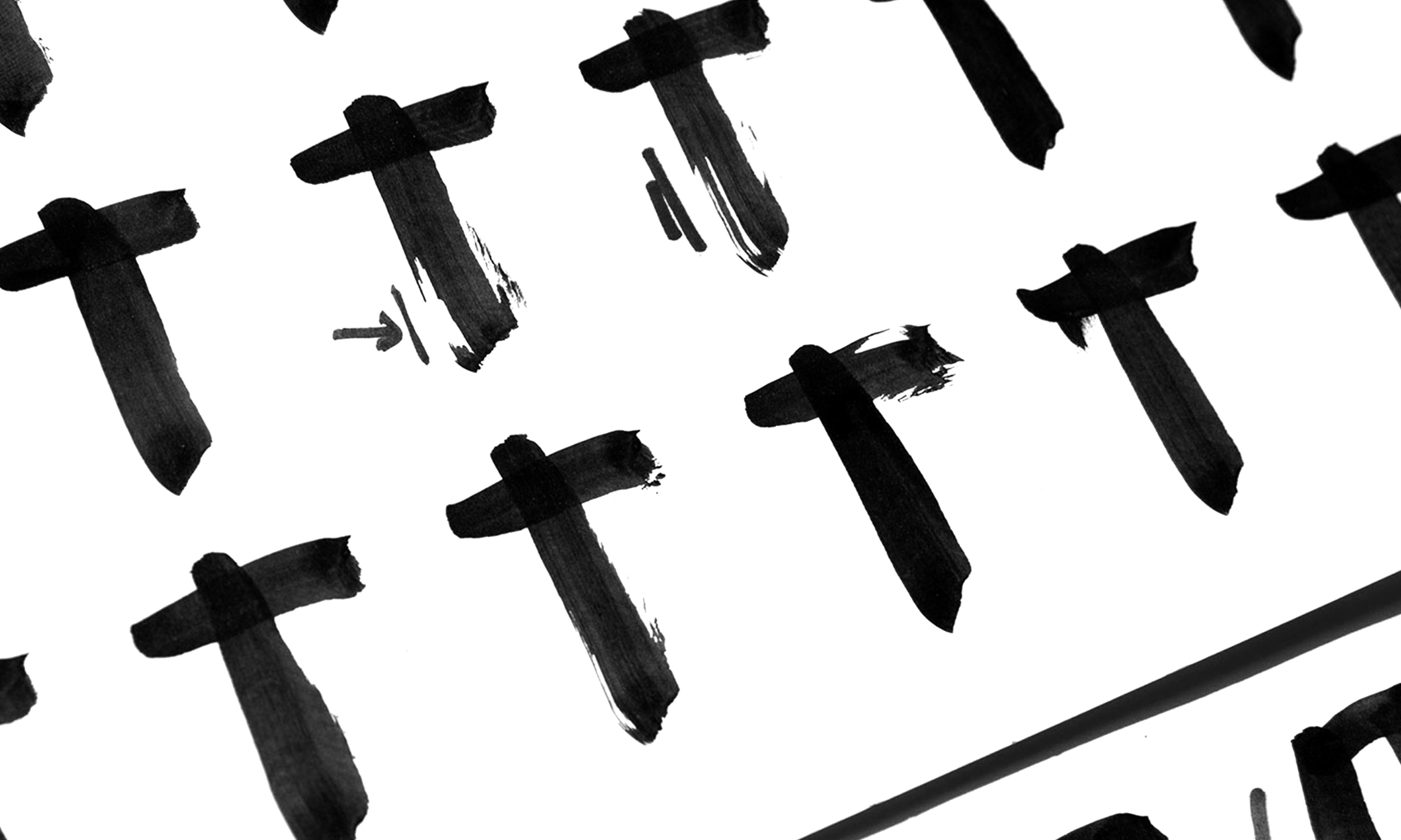
Beginning in the 1990s, Wildcraft grew into India’s most loved home-grown brand of outdoor outfitters. The brand was born when a group of friends who were passionate about the outdoors and pained at the unavailability of quality outdoor gear in India, started making quality, affordable gear in their garage. At the heart of the new Wildcraft identity is a sense of raw liberation that outdoor experiences bring, visualised as a characteristic Wild ink stroke—primal, vigorous and unfettered.
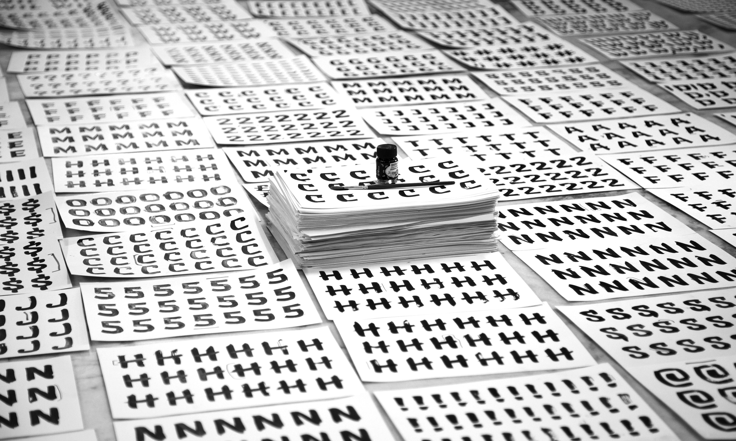
The Wild stroke moves across the spectrum of identity assets to create an entire brand world of forms, type, patterns and icons, establishing its raw, liberating personality across diverse channels & campaigns. Collectively it brings strong recall, differentiation and vibrancy for the Wildcraft brand.
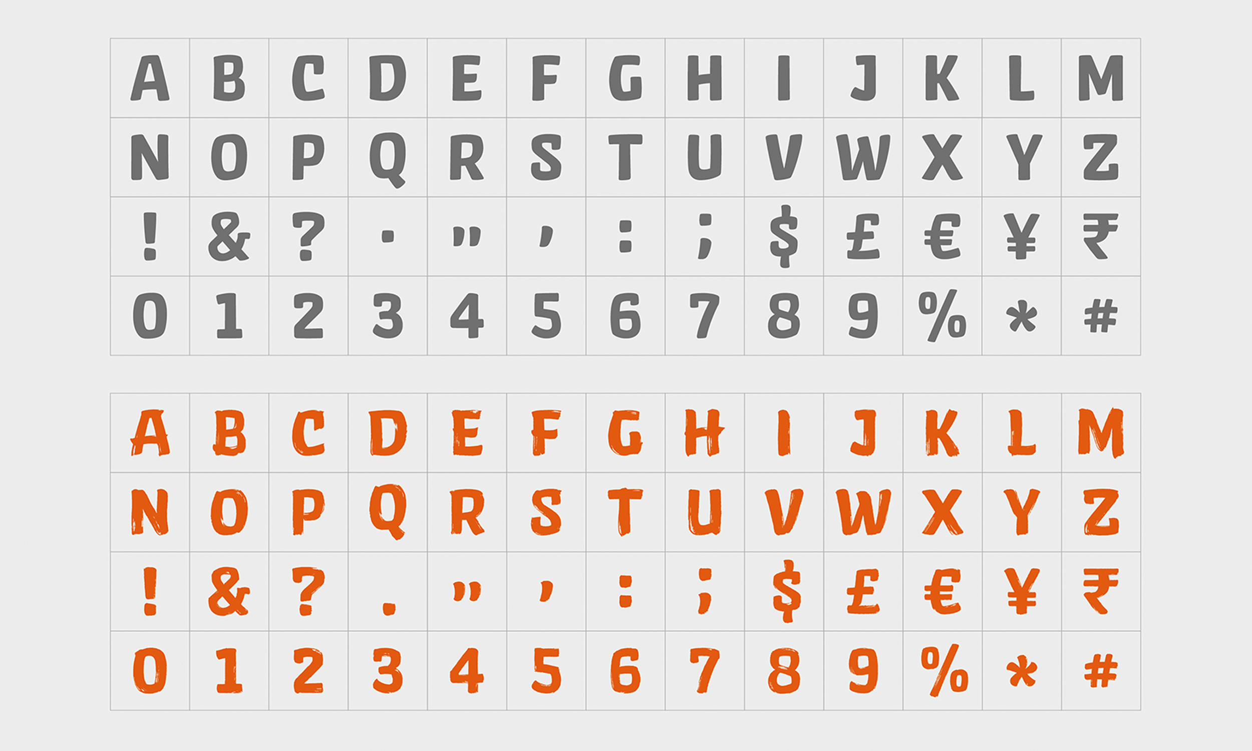
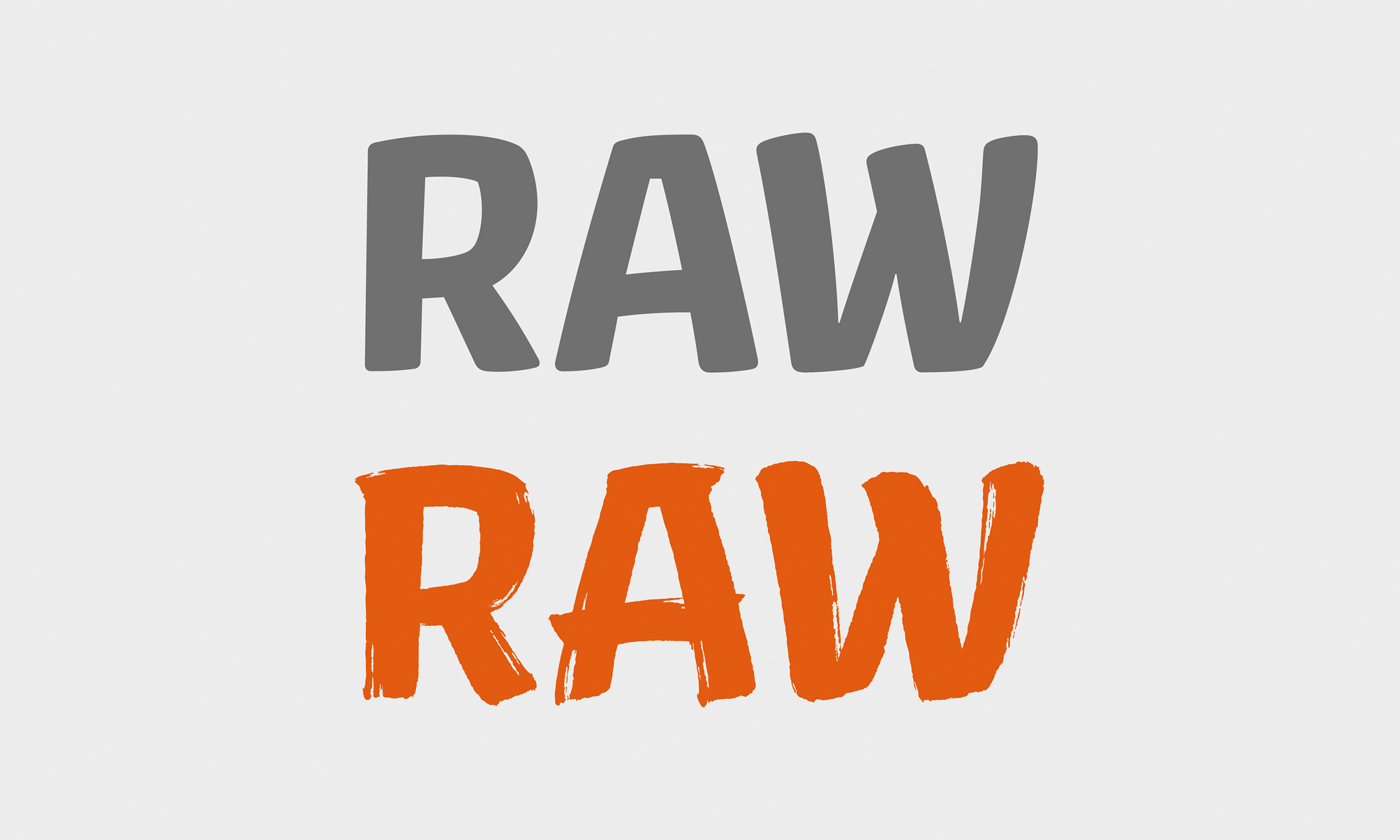
Wild Brush, the font brings strong recall to the brand when used alongside evocative photography or independently. The vibrant nature of the font opens the communication to an inclusive voice, breaking down barriers associated with extreme physical activities. Instead, it encourages exploration and engagement with the outdoors.
